The 09-10 kits are appearing thick and fast. Here is my review of a few of the outfits unveiled a while ago.
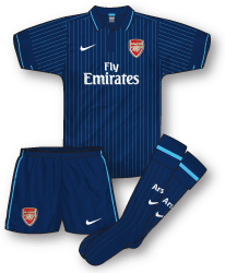
 Arsenal Away Kit 09-10
After the furore surrounding the recent white away and the welcome return of last season’s yellow and navy kit the rumours were that the infamous green away outfit of the early 80s was returning to the Arsenal wardrobe next season. Although it may yet appear as a third kit the 09-10 change strip was in fact revealed to be a simple but classy all navy ensemble. Featuring a very similar cut to the latest England top the shirt includes a neat button up collar and very fine pale blue pinstripes – this particular shade of blue was, of course, popular during Nike’s early years at the club in the 90s. The shorts and socks are basic and functional and are adorned with the merest of pale blue trim.
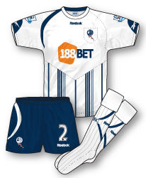
 Bolton Wanderers Home Kit 09-10
All the debate about the Newcastle away kit has somewhat quietened the original disapproval that could be heard when this new Bolton home kit appeared just before the end of the season. Once again Reebok have opted for an asymmetrical look but have splashed a bold arrangement of vertical navy bars at the bottom of the shirt, topped off with a V stitching. In another strange move the shirt features the Bolton badge sitting on a pocket – yes, a pocket! Quite why Premier League players will need a pocket on the shirt is another matter. Its certainly a curious ensemble and one which, although it looks better in the flesh then it does on paper, is, in my view, one of the more overworked and therefore weaker designs for the forthcoming campaign. Further unfamiliarity occurs with the departure of Reebok as main shirt sponsor after 20 years. They have been replaced by online betting company 188Bet who will also be sponsoring Wigan in 09-10.
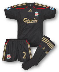
 Liverpool Away Kit 09-10
I’m not a fan in general of black kits but I do think the latest Liverpool away is better than most. Although its not a ground breaking design from adidas, its the combination of red and pale gold that improves the kit for me. The shirt also features what appear to be very subtle animal markings on each side of the shirt – similar in style to the fern graphics that appear on the All Blacks rugby shirt. Some criticism has been levelled by fans at the restrictive neck design which may lead to players ‘customising’ this during games. In seeing the shirt in my local high street I was surprised to see that the colour is in fact a very dark charcoal grey and not black at all. Perhaps this tiny detail is what has helped lift the design.
 West Ham Away Kit 09-10
I was expecting a return of the iconic pale blue away with twin claret hoops but instead Umbro surprised everyone with this all navy Hammers change strip and continued the regular rotation of navy kits, white kits and pale blue kits. A solid, but perhaps unremarkable design, its main distinctive feature is the large vertical pale blue panel, trimmed with white. The shirt also incorporate’s Umbro’s new trend for slightly retro looking collars/necks. The pale blue (which seems a slightly different shade to the usual West Ham blue) white and navy combination is a tried and tested approach – perhaps it might have been interesting to combine claret with the navy this time.

I like the Arsenal and West Ham ones, but the bolton one…will fans wearing it beep when they walk past checkouts? And if so, what would the price be? Class perhaps…
Not trying to be nitpicky John, but should the pinstripes on the Arsenal away be less pale than they are?
Love the new hammers kit, it looks classy. I dont think that claret and navy go well together, so the different shade of blue is a good choice in my opinion.
On the pocket on the Bolton shirt, I think there might have been some confusion at reebok, after doing all those Brazilian teams this year, and forgetting to put pockets on the shirts there (a common design feature in South American kits in the 50s and 60s) they decided to put one on the Bolton shirt. I think pockets can add something to a shirt (Celtic and Chelsea had kits with pockets in the shorts in the late nineties), just that it would have been better suited to Sao Paulo than Bolton. Perhaps a bit of Brazilian flair added 🙂
As a Hammers fan I can tell you that that kit was originally taken pretty poorly by the fans but now not so bad. There is nothing to dislike really other than (and this is my gripe with it) it doesn’t say ‘West Ham’ to me. It’d be a perfect Coventry away for example. Maybe I just don’t get on with navy as our away colour.
As for the Bolton kit, it really does make you wonder what on Earth Reebok are playing at. How much was someone paid to come up with that???!
Good point Ian…it would work very nicely as a Cov away kit…though personally I’d love to see it as a home kit…maybe expand the light blue bit a tad.
See your point Ian, it does not really should out “Irons!” like last seasons nice sky blue change. I dont think Umbro would have made the twin hoop shirt for 2009, but they might just for 2010. Perhaps it would have been better to put out a white away kit instead.
As for the Bolton template, its also being used by FC Koln (Red and white) and also by Lens (Yellow and red) and it does not look any better. Reebok have made some great kits for South American Club teams as of late, so how are they getting it so wrong this season in Europe
The new Goons 3rd kit has been released, same template as the away shirt but white and grey.