Arsenal’s new strip for their last season at Highbury may not be to everyone’s taste but expert John Devlin is a redcurrant fan.
When Second Division Woolwich Arsenal moved into their state-of-the-art Arsenal Stadium in 1913 it cost around £10m (in today’s money). Their next new home, the Emirates Stadium down the road from Highbury, will come in at £357m, so a few extra kit sales would be handy before they bid farewell to their famous old ground at the end of this season.
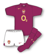
To mark the occasion Arsenal have forsaken their traditional colours in favour of a commemorative strip based on the dark maroon outfit worn in that first Highbury season. Its official name is “redcurrant” – not “sour grapes” as some Chelsea fans are suggesting.
Nike’s design does not replicate the heavy woven material from 1913 and the minimally styled strip, with its elegant gold embellishments, looks to exude sophistication. Not all Arsenal fans share the view, however. Still smarting from the club’s controversial badge redesign in 2002, some feel the change is further evidence of unnecessary tampering with the club’s identity.
But, while these fans would rather the side retained the tank top-inspired red shirt and white sleeves traditionally associated with the club, it should be noted that Arsenal wore an all-red home shirt as recently as 1967.
Since then, amid all the criticism levelled at clubs for changing kit too often, Arsenal have worn remarkably few designs – in fact only 13 different home kits in the last 25 years. Only Newcastle have changed fewer times.
Not that the Gunners haven’t pushed the boat out – remember their zig-zag away kit in the early 1990s? While it was in the club’s favoured change colours of yellow and blue, tradition ended there. Modern printing techniques enabled the shirt to feature an audacious navy blue zig-zag pattern topped with a subtle shadow design. Although it was heavily criticised at the time, many Arsenal fans loved its arrogance and nicknamed the jersey “the bruised banana” due to its appearance from the terraces.
Needless to say the shirt became the fashion must-have in London and redcurrant may yet prove the colour to be seen in this season. Arsène Wenger will just hope the new kit retains the form his side showed when they turned out in traditional red-and-white at Highbury for the very last time. Then they beat all-blue Everton 7-0.
Other striking strips
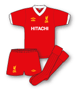 Liverpool home 1979-82
The shirt that started the commercial ball rolling. While non-league Kettering Town had experimented a few seasons earlier, in 1979 Liverpool did a deal with Hitachi and the first sponsored shirt worn by a professional British football club was born. The logoed version was worn only at non-TV games, mind you. But either way the strip was a classic.
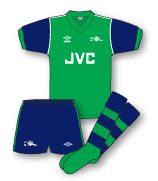 Arsenal away 1982/83
Umbro broke with tradition in 1982 by ditching Arsenal’s traditional white crew neck from the home shirt and kitting them out away from Highbury in an unfamiliar colour scheme of green and navy blue. It failed to find favour with the Arsenal faithful and the green strip was withdrawn after one season, the club opting for a far more sensible yellow-and-blue design instead.
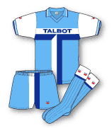 Coventry home 1981-83
The ban on sponsored shirts in televised matches was not lifted until the 1983-84 season. Before then the Coventry chairman Jimmy Hill tried in vain to change their name to “Coventry Talbot” as part of a partnership with the Coventry-based car makers. He did, however, succeed in sending them out in kits on which the Talbot logo was integral to the design. So integral in fact that they had to wear a totally different strip whenever the cameras were present.
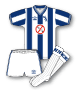 West Brom home 1984-86
In 1984 West Bromwich Albion’s shirts helped promote a West Midlands Health Authority initiative. “Be like Albion – kick the smoking habit” sang the strapline.
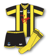 Crystal Palace 1990
Palace wore their standard home strip of red and blue in the 1990 FA Cup final against Manchester United. Following a 3-3 draw United switched from white to red and Palace, rather than use one of their standard away kits, chose black and yellow stripes for the replay. They lost 1-0 and never wore the shirt again.
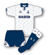 Tottenham home 1991-93
The 1991 FA Cup final between Spurs and Nottingham Forest will forever be remembered as the match in which Paul Gascoigne almost ended his career. It also saw the first glimpse of Spurs’ long Umbro shorts. Initial amusement was followed within two years by virtually every club in the land adopting the fashion.
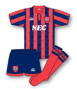 Everton away 1992-94
Umbro was looking to the past for much of its inspiration in the early 1990s. In 1992 it chose to dress Everton in a shirt based on the colours worn by the club 100 years earlier: salmon pink and navy blue. The only trouble was that the pink bore a little too close a resemblance to red for some Everton fans.
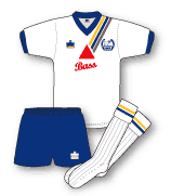 Derby home 1984-85
One of the first shirts specifically launched to commemorate a club’s centenary was this Admiral affair for a Derby County side then languishing in the Third Division. The shirt featured a diagonal sash over the left shoulder of a blue, amber and chocolate stripe in honour of the colours first worn by the side in 1884. Among other clubs to have sported special commemorative shirts since then are Charlton, Bolton, Crystal Palace and now Arsenal.
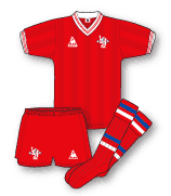 Chelsea away 1985-86
Le Coq Sportif helped revolutionise kit design in the early 1980s. Gone were those itchy jerseys of the ’70s; in came silky and shiny designs which oozed continental elegance. For the last year of a five-year shirt deal with the French company, Chelsea wore an all-red away strip. According to chairman Ken Bates’ column in the club programme, this was because the company was unable to source a suitable yellow fabric – Chelsea’s first choice – so they went red instead.
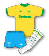 Portsmouth away 1989-91
The influence of Brazil on the world stage has led to almost every English league club turning out in yellow as an away choice at some point. Portsmouth went the whole hog in the late ’80s in this Scoreline-produced homage to the Samba Boys – right down to the green and yellow trim on white socks. Other teams such as Swindon and Crystal Palace have also sported exact replicas of the famous Brazilian colour scheme at various times in recent years.
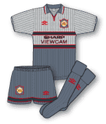 Manchester United away 1995-96
This two-tone grey affair proved one of the most controversial kits in football history. The strip is infamous for its part in the 3-1 defeat at Southampton in April 1996 after which Alex Ferguson blamed it for the team’s poor performance. The Red Devils consigned the strip to the dustbin at half-time and switched to blue and white after the players complained they could not see each other.
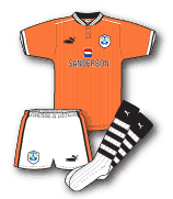 Sheffield Wednesday away 1997-98
Football kit influences can come from many sources but few are inspired by fans. The origins of this design can be traced to one Paul Gregory, an Owls fan famous for stripping off his shirt, who became known as “Tango Man” due to his similarity to the bright orange character from the soft drink advertisement. When Puma were considering colours for the Owls’ next away kit there was really no decision to make.
· True Colours, a guide to modern football kit design by John Devlin, is published by A&C Black in September. It features nearly 1,000 illustrations of every current Premiership club’s home, away and third kit from 1980 to the present.
Article Source: The Guardian, August 2005

I went to watch Stoke City V Man Utd Reserves in the 95/96 winter. United wore the Manchester United grey away 1995-96, this was before the Southampton away PL game. Stoke generally only opened 1 stand at the old Victoria ground for reserve games. As a bit of a kit connoisseur I was surprised United wore very bright red standard issue Umbro Red shorts and socks, as there was no clash with the Stoke kit. Ferguson’s comments after the Southampton away PL game then made sense of this. I imagine the situation was worse for the reserves in a half empty ground!
There is a story behind the Palace 1990 Cup Final Replay shirt. Apparently the club wanted something different for the replay and captain Geoff Thomas suggested the kit as shown as they were his school team colours!
Andy, you don’t know where someone could lay their hands on a Cup final replay shirt do you? Were replicas ever made?
that grey strip was terrible,seem to remember that it was designed for the fashion market as it went well with jeans!! no United fan i know ever bought it,terrible strip.
Yep, the mid-late 90s were all about shirts that looked good with jeans. You must remember though that this was the period where EVERYONE seemed to be wearing a football top.
The 90’s was the decade that style forgot, especially in the middle of the decade where many clubs were turning out in some really shocking kits.
Whilst the top flight teams caught a bit of the abstract over- the-top design bug it was all too frequent in the lower divisions with manufacturers such as Ribero, Matchwinner, Super League and even some clubs’ own brands being the worst offenders.
Thankfully common sense started to prevail towards the new millennium and the abstract designs and complicated patterns were replaced by simple and stylish efforts.
Ironically since this article above appeared in the Grauniad (sic) Arsenal have had two more kits which have divided the Gunners faithful – namely the white away kit of last season because of white being synonymous with Spurs (despite the fact Arsenal wore white as an away kit up to the mid 60’s) and this season’s home kit not having white sleeves.