 It was a great honour for me to find out that the Nike football kit design team are fans of my True Colours books and have actually used them as reference when researching and pitching new kit designs and I was absolutely delighted when the design team agreed to an exclusive interview for my site:
Could you introduce yourself please and what your jobs/responsibilities are at Nike?
Stewart Scott-Curran, Apparel Graphic Designer for Licensed Gameday. I work together with the Product Designer to generate innovative concepts and solutions with specific regard to Club and Federation kits.
Could you give a few examples of some of the kits that you have designed?
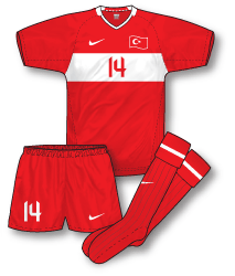
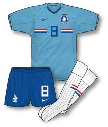
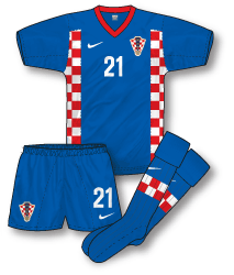
A few of the kits we have recently designed are the 2008 National Team kits you may have seen on-field at the European Championships (Holland, Croatia, Turkey and Portugal being a few examples of these) and the Club kits for the season 2008-2009, including Arsenal, Manchester United, Celtic, Barcelona, FC Internazionale and Juventus amongst others). We currently design apparel for a total of 42 different Clubs and Federations.
How did you get first get involved in football kit design?
I have always been passionate about sport in general, and football in particular. When I was young I used to spend a lot of time drawing the football kits of my favourite clubs. So the opportunity to be part of the design team for the world’s most innovative football brand was too good an opportunity to miss.
What is the basic procedure for designing a kit? (eg timeframes, initial concepts, design approvals, prototypes etc)
The time from initial design concept to the launch of the kit is around 18 months. The first stage is research. We visit the clubs, talk to athletes and arrange meetings with supporters groups. We find out what is important to each of these groups of people in terms of technology, design aesthetic and what the core values of the club are. We use these valuable insights as inspiration tools for our designs.
We develop our designs internally for approximately 2 months, exhaustively refining details until we are at the stage that we are ready to present our ideas back to the Club.
We travel to the Club with a series of early designs on paper boards which also include options for graphics. We usually don’t produce any samples until we get feedback from the decision makers.
After a few months of work and several garment samples, we head back to the Clubs to get the final sign-off . Once rubber-stamped, preparations begin for the kit’s launch. Sample shirts were produced to show retailers and a marketing campaign is devised.
How much input do the club/players have into kit design?
The athlete is at the core of everything we do and player and team feedback is fundamental. We spend a lot of time working with the athletes and hearing what they have to say. We use this information to help us generate innovative and inspirational design solutions which give the athlete a performance benefit.
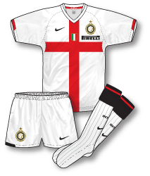 What is your favourite kit that you’ve designed – the one that has been the most rewarding to work on?
I have many personal favourites. One of the great things about what we do is that every kit has it’s own unique design challenges and opportunities. However, if pressed, I would have to pick the FC Internazionale centenary away kit of season 07-08 as a personal favourite. I think this is a great example of what can be achieved when you speak to the right people and work closely with the club. I think we ended up with a kit that pressed all the buttons in terms of a unique aesthetic, authentic details and innovative performance. It was a fitting shirt for the club to be wearing during their centenary celebrations.
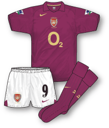 What is your favourite kit of all time?
This is a frequent topic of discussion in the Nike Football design studio. The simple design and clean execution of classic kits is always an inspiration. From that point of view, I think the red current kit we did for Arsenal’s last season at Highbury was amazing. However, as designers, we are always looking to the future and getting excited about what is coming up. So I would have to say that my favourite kit is always ‘the next one’.
What, in your view, are the essential elements of a good football kit?
A good football kit strikes a balance between innovation and inspiration. It must be comfortable for the athletes to wear and not offer any distractions on-pitch. Football matches can be won and lost by the smallest of margins and if we can give the athletes any performance advantage over their rivals then we are doing a good job. However, the kit must also connect with the fans. We do this by adding authentic graphic details that really express the Club or Federation’s DNA. We always strive to strike a balance between pure performance and this emotional connection.
As you both come from the UK, how difficult is it design strips for other countries/ cultures?
We spend a lot of time visiting the Clubs and Federations and talking to the athletes and the fans. By fully investigating the culture around a National Team or Club we can really get a feel for what their unique core values are. Of course we also have a lot of help from our colleagues who work within the countries and who communicate with the Clubs and Federations on a daily basis. Together we can really gain a lot of valuable insights into what makes the Club or Federation tick. If we do our research properly, then we usually get things right.
Nike seem to come in for some criticism from some football kit messageboards that say their designs are too plain and simple. What are your views on this? (My personal opinion is that kits are designed for a purpose on the field – not to please football kit fans – and that most football supporters actually prefer simpler, timeless designs)
One of the great things about Football Kit design is that there are so many passionate opinions out there. Our aim is to produce the best football kits in the world. We know by talking with the athletes that they are looking for a comfortable kit with zero distractions so they can focus on what they do best. We strive to produce something that gives a performance benefit to the athletes and creates an emotional connection to the fans. We feel that the simplest and most intuitive solution is usually the best and I think we are generally very successful at doing that.
 The latest Arsenal home and away outfits have created quite a stir amongst football shirt fans. Can you tell me any more about these designs and how they arose?
When it came time to design Arsenal’s home and away kits for season 2008-09, we realised that it would be 20 years since they had won the title in such dramatic circumstances at Anfield on the final day of the season. When speaking to the fans about the many great moments in the Club’s history that really resonate with them, the 1989 title win consistently comes out top of the pile. We thought this was was worth celebrating and that the story would lead us to some very interesting and unique design solutions. We talked through our designs with the Club and together we came up with something that we feel conveys the spirit of the achievement with a very modern and unique aesthetic.
I know Nike often take a conceptual approach with many of their shirts – can you give some examples of these please?
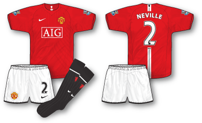
Some recent examples of this approach would be the Manchester United shirts of 07-08. We felt that at that point in time the Club were open to doing something different. A football shirt that we had never seen before. We went away and brainstormed what this could be. We finished up with a kit that really conveys a sense of speed, style with substance and unique quality. All of which adjectives are synonymous with Manchester United and deeply rooted in Nike’s DNA. It has ended up being the most successful United shirt we have ever done.
Stewart, thanks very much for the interview, its fascinating stuff, you quite clearly have possibly the best job in the world! I really appreciate you taking the time to do this.
(c) 2009 John Devlin. No part of this article may be reproduced without permission.

A great insight into the normally closed world of Football kit design.
Good interview John, he nicely sidestepped the question about the Arsenal home and why they ditched the white sleeves though!
Very jealous of his job also.
It’s nice to see that Nike do go talk to the clubs and federations, and I think that is quite apparent in their most recent creations. However in previous years I think their is more of a case for the ‘cookie-cutter’ comments you read a lot. Maybe though that it just the Federation going back to them saying they are not to bothered in the design just something incorporating their colours.
In fairness to Nike, since the 06 World Cup, they’ve given countries unique designs
Great interview. My missus would like to know why there seems to be a very limited color scheme for Premiership kits.
Dear Stewart Scott-Curran (if you’re reading this),
Please do not make us (The Arsenal) look like Charlton. It’s very simple.
Home – Red shirt with white sleeves
Away – Yellow shirt with blue sleeves or Blue kit
3rd – Rehash the Away from previous season
Keep us on two year cycles, it’s much easier on the wallet.
Regards,
Every Arsenal supporter
carnt believe the United shirt is the best one nike have produced in shirt sales? think its poor actually,but i suppose when your succesfull it helps shift shirts! i think nike have only done 3 or 4 good United shirts,they never seem to get it right.
Excellent interview…
I agree with him on Inter away centenary jersey as one of the most beautiful kits ever designed, no only by Nike, but by any sports apparel brand ever. I would also include Barcelona 99-00 Centenary, Juventus 03-04 Pink, Valencia 04-05 away kit (the one with red and yellow stripes and blue slevees), and Celtic 06-07 Euro away kit (black and green stripes).
I also agree that he has one of the top three greatest jobs in the world!!!
I never liked that Man U shirt due to that white stripe down the back…always made it look like the label was sticking out. I did like some of Nike’s kits at Euro 98 though.
I really like Arsenal away kit which was wonderfully design but this year these kits not giving any luck to Gunners this year…Title is away from them now.
Over the last few years Nike has consistently out-designed adidas in kit design. As an American soccer fan (MLS), I hate the fact that adidas holds the exclusive sponsorship for the league’s kits.
This isn’t always the case, but for the most part:
Nike=simple, classic, clean, traditional
adidas=modern, busy, funky shapes
arsenal are red shirt white sleeves. end of story.
Great interview John!
Quite often, the people that work for kit companies can come across as a bit boring and unenthused by their job, but they gave an interesting insight into how their designs eventually become reality.
Kudos to you that they appreciate your True Colours designs… they’ll be offering you a job next!!
I think the issue with the sleeves on the Arsenal kit is, they have changed them this year to create a reson to change them back. Nike have provided Arsenal’s kit since 1994 and this years was the 9th different home strip, it’s hard to keep coming up with variations on red shirts with white sleeves.
The Arsenal kit is a classic and unique to them design,but so is Ajax’s and they keep to tradition and still change.
Andrew, you’re right about it being the ninth home kit, but it’s only the eighth red and white one 😉
But manufacturers have to keep coming up with variations on a theme. Look at Newcastle, Adidas since Aug 1995 with 7 different styles, they have tinkered with different stripe widths, collars and sleeves.
Nike only have the sleeve to play with on the Arseanal strip.
I know what you’re saying, but all those Newcastle kits have had stripes, they haven’t all of a sudden gone with halves or black shirts with white sleeves.
The white sleeves should be an integral part of the Arsenal kit, and there is still room to play with that, as well as having different tertiary colours (Nike have used navy, yellow, gold and redcurrant)
Thanks for all your replys everyone – good to hear from some Gooners, I have to say I do think the club should always have the white sleeves, its too unique and too good in the football world to be ditched – it makes Arsenal’s kit distinctive.
What strikes me the most about the interview is the integrity Nike employ when designing a kit. They have a concept – a plan. That of simplicity and elegance and I think thats really noticeable in their designs. People that criticise them as being plain and boring are really comparing them to strips produced by other kit manufacturers and not appreciating them for what they are. Adidas and Umbro kits are known for their flamboyant and intricate designs (which is fine!) and Nike should be recognised and acknowledged for the distinctive minimalist, simple look they give to their kits.
For years people have complained that kits were getting too gaudy and complicated (we only have to look back to the early 90s for evidence of this). What Nike do in my opinion is bring a clean aesthetic back to designs that appeal to the everyday football fan. They also put thought and care into the story behind each kit and apply unique characteristics to each one, rather than just employ the same template in a number of different colourways.
Chris O – I’ve just read your comment again and noticed your last sentence!! Funnily enough, ‘Can I have a job?’ was going to be the last question in my interview but I thought I’d better take it out!!
Can u please tell me how I can apply for a job like this within Nike? Reason being is that the recent design for kits is really really poor. Adidas are overtaking. I believe that I have design that will make Nike kits best sellers and awesome design. If you could Private Message me to my email.