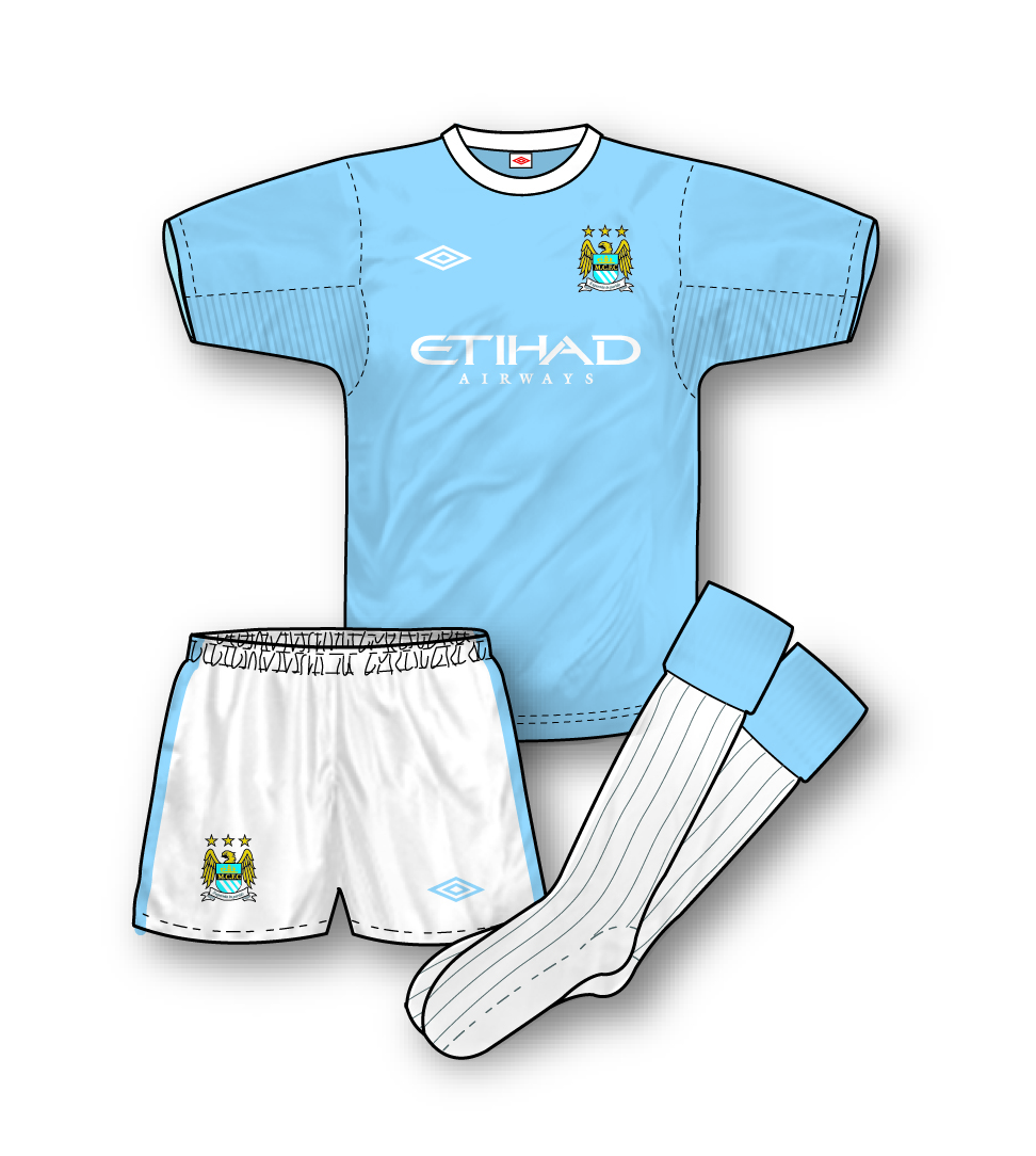
 Manchester City Home Kit 09-10
The best kit of 09-10? Quite possibly. Umbro have made a triumphant return to the blue side of Manchester with this exercise in simple, classy design hat is reminiscent of the clubs late 60s/early 70s kit. The jersey, which was launched amidst great ceremony, is formed from the same fabric as the new England shirt with which it shares the ‘Tailored by Umbro’ theme and new Umbro logo (unlike all other domestic Umbro kits this year) thanks to the high profile and importance of the deal. A simple crew neck adorns the jersey with ribbed fabric under each arm. The kit also includes white socks for the first time since the mid-90s. It remains to be the seen whether the team’s performances will match the quality of their kit.
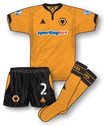
 Wolverhampton Wanderers Home Kit 09-10
Premier League new boys Wolves will also sport an unfussy design in 09-10. Like the Manchester City kit the overall appearance is simple and uncluttered. The shirt features an interesting baseball jersey style collar with button neck and breathable fabric panels on each side.Chaucers have been replaced as sponsors by online betting company Sporting Bet whose brightly coloured logo stands out well on the famous old gold of Wolves.
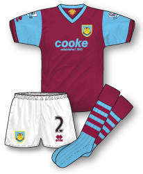
 Burnley Home Kit 09-10
Hmm…I’m noticed a pattern here…fellow Premier League newcomers Burnley have also opted for a simple design this season although theirs is unashamedly retro in style even to the point of manufacturers Errea moving their logo discretely to the right sleeve. The shirt borrows the styling of the club’s 1950 jersey with slim V-neck and simple contrasting sleeves. Its another great design for 09-10 although some people have criticised its overly backward looking appearance. A new club badge has been introduced along with new sponsor Samuel Cooke & Co – a fuel distribution company. This kit will always be remembered though for the club’s return to the top flight for the first time in 33 years and a certain 1–0 win over reigning champions Manchester United.
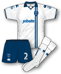
 Portsmouth Away Kit 09-10
Pompey have looked into their past with the inspiration for their new away kit – back in fact to the home outfit the club wore in the mid-70s with navy blue now replacing royal blue. The kit is made by troubled sportswear firm Canterbury is a typical good, solid design. The jersey incorporates a 70s style inset wing collar with the Canterbury logo sitting neatly in the centre. The shirt has not yet been worn at the time of writing so it is uncertain quite what the placement of new sponsor Jobsite’s logo will be.

I do not think the Man City kit is the best, Liverpool’s Euro White kit looks stunning! United’s Away, despite being similar to the Home kit, it isn’t too bad either. Another jersey worth reviewing is the 2 new Chelsea Away kits. the one with black and navy horizontal stripes and the 3rd in white with navy thin hoops.
Hope you can do the above reviews in the next post. (:
Good shout Joshua, I’ll get those added. I do like the City shirt though. I’ve just got the away and although I’m not a fan of black kits this one is also very nice.
The Man City Home is pretty nice, but the away and third look outstanding (not a city fan ahaha). 🙂
Wouldn’t wear them though, since I don’t know much about the fabric – and how it performs in humid climates (like where I am)