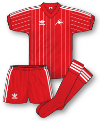
For me one of the best kits from the early 80s was Ipswich’s all blue adidas outfit with non-contrasting V-neck/cuffs and white pinstripes. North of the border Aberdeen wore a red version that definitely rivals Ipswich’s kit for class and elegance. It also accompanied the Dons in their most successful era where they broke the Old Firm dominance of the Scottish game. Thanks to Alex Ferguson’s management and a superb set of players they won the League in 83-84, the Scottish Cup (82-83, 83-84) and of course the European Cup Winners Cup triumph over Real Madrid (82-83). All in this simple yet smart kit.
Worn in: The unforgettable 2-1 win over mighty Real Madrid in the 82-83 season.
Worn by: Gordon Strachan, Willie Miller, Alex McLeish and Mark McGhee.


Nice to see AFC featured John. What chance us being included in True Colours 3?!!
The non contrasting sleeves and collar plus pinstripes make this an absolute classic, coupled with the iconic win in Europe it’s one of my all time favourites.
I really like most of the adidas kits from this time. One of my favourites John has shown in the recent update to the QPR kit history. Its the red and black away kit used through the 80s – class.
http://www.truecoloursfootballkits.com/wp-content/uploads/2009/10/qpr-a-83-86.gif
Its a great kit. Its seems such a long time ago that Aberdeen and Dundee United were feared by the Old Firm. It proves that Alex Ferguson was a great manager even back then. I love the vintage Adidas logo, I might like to have seen it on the new Scotland kit.
You’re right Mike – the late 70s/early 80s was a golden era for adidas – although I have to eat my words and say I’m like many of the new adidas kits for the WC. I wasn’t impressed at first but the new South Africa kits are superb.
Wouldn’t it be good to see Aberdeen, Dundee Utd, Hearts and Hibs providing a decent challenge to the Old Firm Ricky? I agree with you about the old adidas logo – seems odd that many people don’t make comment on this though. I always thought it was a classic.
I never was a fan of the ‘new’ Adidas logo. The classic trefoil logo is one of my favourite logos of all time. It just looks the part on all sports clothing.
Cheers,
Willie
Agree re the adidas logo. The ‘adidas equipment’ logo is just too clinical and nondescript. The trefoil evokes so many memories! Surprised, given the penchant for retro, that they haven’t used it at least once on a football shirt.
adidas have re-released some old 80’s kits with the trefoil logo,l’pool,bayern and milan.Great logo and always been a favourite of mine.
The 85-86 Liverpool kit was a classic for me…but the re-release isn’t quite right…it has a crossover neck and the original didn’t…can only assume they might be doing this on purpose (possibly so as not to impact on the value of the originals?) as their re-released Holland 88 had the pattern upside down for some reason.
The story of the adidas logo is interesting. This is purely from memory, but the trefoil logo was ditched originally in 1991 along with the classic three stripe trim (see Liverpool’s 91-92 kit for an example) to be replaced by the ‘adidas equipment’ brand which featured more or less the adidas logo in use today. The following year ‘equipment’ was removed to leave the logo identical to today’s.
Then in 1994 Britpop arrived along with a massive retro trend in classic adidas leisure wear. Mysteriously the adidas logo was then reduced to just the word (or logotype) – possibly due to a backlash against the new logo amidst the fondness for retro design?
This logo continued until 1998 when the current adidas logo (the same as the adidas equipment logo, minus the word equipment) was reintroduced and has remained albeit with some slight tweaking, until today.
You’re correct Rich, that re-release of the Liverpool is a little irritating due to that wrapover V-neck design which, as you rightly point out, was not on the original.
gothenburg 1983 is what i remember of this kit,fergie and archie knox dancing on the touchline in there adidas manager coats in the rain.
Good idea John, I remember those big old adidas coats too – should have illustrated them instead!
Remember Dalglish’s favoured adidas coat as well a few seasons later?
I remember Kenny’s favoured adidas coat – grey and red, when Liverpool started using grey as a tertiary colour (due to the away kit at the time).
He’s got a new favoured coat now, in black. So good to see him back in the Anfield dugout once more!
Forgot to mention, the adidas Trefoil logo is a classic and sorely missed from football shirts. The current logo just doesn’t have the same ring to it.
Also sorely missed from adidas kits today is the iconic, UNBROKEN, three stripe trim. Thanks very much FIFA and UEFA and their penchant for unnecessary, “must not be obstructed” tournament logos.
Good point about the unbroken three stripes. I have a theory that is to encourage people to buy patches (for which no doubt FIFA/UEFA will get a royalty) to avoid having blank spaces on the shirt. Its a nonsense rule – can’t see any other reason for it.
This kit was originally designed with white neck and cuffs but Alex Ferguson complained that it made them look like Nottingham Forest so they changed to red trims