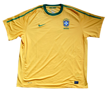
 Most replica shirts are naturally bought by diehard fans who want to show their support for the team. But if I were to choose one shirt that seems to transcend affiliation more than any other and is snapped up in soccer shops worldwide it would have to be the iconic yellow and green of Brazil. It seems you don’t have to be Brazilian to wear the jersey, such is the legendary status of the country’s teams over the years and the standards of excellence and flair that they represent. By donning the jersey you show the world that you love good football and out of all the World Cup apparel available the Brazilian shirt is always a big seller.
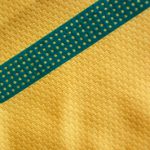
Nike introduced a new Brazil World Cup Jersey prior to the tournament’s kick off and its a superb looking minimalist and elegant shirt with the only trim of note being green stripes down each sleeve and round neck design, making it slightly reminiscent of the country’s 1998-2000 strip. The stripes are actually made of a rubber-like material with lots of tiny holes and on the left sleeve the stripe incorporates five stars – symbolising the country’s five World Cup triumphs.
The Dri-FIT fabric used is part of Nike’s ecologically sound ethos and is comprised of up to eight recycled plastic bottles taken from Japanese and Taiwanese landfill sites and then melted down. All in all Nike have prevented 13 million bottles from going into landfill sites with the creation of their new range of shirts.
Apart from being incredibly comfortable to wear there are lots of little details that make the shirt interesting. Inside the neck there is a tiny Brazilian flag with the legend ‘Nascido Para Jogar Futebol’ or ‘Born to Play Football’ and on the back of the neck there is a green panel with ‘Brasil’ text. A mesh fabric runs down each side of the jersey for ventilation.
Turn the shirt inside out though for a real surprise as on the reverse of the badge (placed over the heart of course) is the message ‘Pride and Love’ beautifully rendered in a font designed by a Brazilian artist. Its a great, subtle touch and an similar graphic relevant to each country is included in most if not all of Nike’s national shirts in their soccer apparel range this year.
Without being burdened by unnecessary design elements the shirt is simple and classic with impressive environmental qualifications and the added bonus of an inspirational message over the heart!


It’s a nice shirt and is quite similar to what Manchester United will be getting next season, but it includes one of my least favourite trend of recent shorts – the team name on the back below the collar. That is really unnecessary and always looks tacky to me.
John, thought i’d seen it somewhere before and it does have a striking resemblance to the 1998-2000 shirt. I’m with Tim regarding the “tacky” name on the back below the collar, why? Can not see the point at all of the stripes down the arms either? I always think of Brazil shirts as plain yellow with subtle green trim. Considering the predominance of green in the national flag it has very minimal representation in the countries kit.
Do like the “Pride and Love” design on the reverse of the crest and the overall minimalistic excluding the green stripes!, look and well done Nike for the eco friendly production.
The post above this one is SPAM and needs to be deleted.
Back to the topic, I quite liked this Brazil shirt and found it a real crying shame that they’ve decided to abandon in in favour of a real monstrosity which looks as if it features meshed shammy cloth and gaffer tape in time for the Copa América.
Thanks for the tip Jon – spam deleted. I really am not fond of the new Brazil shirt – must prefer this one.
This was the kit I always wanted as a kid! Iconic for my generation