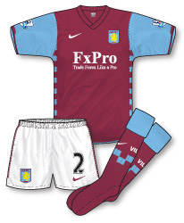
 Nike have stuck pretty rigidly to Villa’s traditions since arriving as kit supplier in 2007. This time round they’ve replaced the light blue necks that they’ve used on all three of their previous Villa kits with a non-contrasting claret V-neck design and added a Croatia-esque chequerboard pattern down each side of the shirt to add some degree of flair. A similar pattern (reduced in size) forms the trim on the shorts. The biggest change (apart from the presence of new sponsor FxPro who replace children’s hospice, Acorns) is the introduction of claret socks for the first time since 2002–03. FxPro are a foreign exchange trading company who must be doing well as they are also sponsoring Fulham this season! Although its an effective, traditional strip and the chequerboard motif lifts it somewhat I can’t help but think that Villa kits in recent years are stuck in a bit of a rut. Its interesting that Nike have often dabbled with Arsenal’s white sleeve heritage but are less keen to tamper with Villa’s blue. Is it a teamwear issue perhaps?
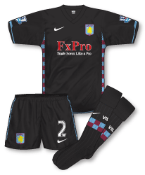
 The away kit follows the same design (including the chequerboard sides) but in black – the first time the club have worn the colour to this extent in 10 years. Utilising the same template with its splashes of claret and light blue works really well (especially on the socks) and ensure that it retains Villa’s identity for the 2010–11 season. The FxPro logo in red raises questions of legibility however.

These kits do nothing for me. And it takes a lot for me to not like an all-black kit, but the chequerboard sides are terrible.
I know the Villa home kit is one of those kits that is hard to re-invent every now and then, but surely adding a subtle third colour would have been better than the Croatia-esqe design.
By the way, I’m really enjoying the new strips being put up like this, and everybody commenting on them. Keep up the good work, John! 🙂
Villa’s first two Nike home strips were golden, but they should’ve given each a two-year lifespan. Wasn’t so impressed with last season’s effort, to me the sleeves looked to shapeless.
Interesting to note the return to claret socks, although I couldn’t help but notice that in wet weather the blue of the sleeves doesn’t match the blue on the socks. This was apparent during the opening match of the season.
Perhaps it’s time for Nike to reintroduce yellow/gold into the Villa colourset? Perhaps the Nike tic and other trim could be this colour, like the 95-97 strip?
Personally I think the away kit works quite well.
I always feel Villa’s home kits work best however with pale blue shorts a la Diadora’s 2000-01 effort.
Nice to see last seasons Newcastle kits sneaking in under the radar in the 09-10 section.
I personally love the away kit…I think the chequerboard sides look great against the black. Home kit is ok, but nothing special. It’s interesting to see where kit designers are prepared to go with clubs whose kit is associated with a certain design as well as colours (i.e. the red shirt / white sleeves of Arsenal). It does tend to be somewhat limiting. I’d love to see Villa back in their late 80s hummel outfit (though I think I might well be about the only person in the land! 🙂 )
Glad you spotted that Mark! You’ve prompted me to complete 09-10 – to be honest it was the third kit that was holding up proceedings there.
Back to Villa – I agree with you Rich, I think the chequerboards to lift what otherwise is a rather ordinary set of kits. Mark, pale blue shorts might be good – how about an all claret outfit? Could be really stylish and make a substantial difference to other claret/blue sides. Nick, its funny I was thinking about how a yellow/royal blue away kit might shake it up a bit. I seem to remember Villa wearing that combination in the early 70s – and I am with you 100% on two year kits.
And Eric, thanks for the compliments – it means a lot. Cheers!
How about Claret shirts and shorts with Sky Blue socks? Evoking images of Villa from the 83-84 season.
what happened to the 2year kit charter that all premiership clubs agreed to? i can deffo remember man. utd agreeing to it,thats gone unsuprsingly!! if kits are goona change every season you can see why its hard for designers to come up with new ideas. i dont mind the villa kits,there nothing special though,i always liked the le coq sportif kit from 1984 for some reason despite being a bit of a traditionalist when it comes to football kits.
I actually like what Nike have done with the new Villa kits. The only thing I’m not too keen on (and this is not Nike’s fault) is the sponsors logo. I admit to being a bit of a logo snob and in an ideal world would want this to be as well designed/smart as the kit it was going on. Like it or not, it will effect the overall look of any top.
It’s an ongoing problem for designers on how to make a clubs “signature kit” look slightly different each year. A good example would be Celtic who must provide a headache for whoever has to design their kit.
My team Motherwell have a tradition of having a claret hoop/band on their top and go forbid any manufacturer who designs our kit without one. One fan said to me that the only question he would want to be asked about our kit would be… “How wide do you want the claret hoop?”.
Cheers,
Willie
John B:
I’m sure all that “2 year rule” stuff was just press talk. Middlesbrough for example have changed their home kit every year since 1994 – yet it was United that came in for criticism. Some things never change.
tim ,i think i could dig out an old programme or yearbook with peter kenyon stating in the club charter that each kit should last 2 seasons,thought it might have been all premier league teams?
If you could find it and point me in the right direction of a scan of it, that’d be great, John.
will do tim,when i get 5 minutes!!
I noticed Villa have retained last season’s away kit as their third kit for this season, but with the FxPro on the front instead of Acorns. I don’t know if the kit will get called into action this season though. Last season Villa did the same with the turquoise kit from the season before, but it was not required.
Re 13: Jon I believe that Villa, thinking they would need a third kit for the Uefa Cup, had last seasons away kit redone with the new sponsor.
I think UEFA have a rule in place where clubs taking place in the Champions League or Europa League must have a designated third kit, which would explain the decision for Villa to keep the white kit as a third choice. However this won’t apply as Villa got knocked out of European competition last week.
Villa might use the white kit at West Ham, just as they did the last time they had black as their second choice kit (back in the 00/01 season), but we’ll have to wait and see on that one.
Great illustrations and write up as ever, John. 🙂
Just wondering what the last line meant…
“The FxPro logo in red raises questions of legibility however.”
I should have listened more in school, I guess. 😛
Thanks Trevor – basically I thought it was a bit odd to have red text on a black background when it would have made more sense to have it in white. Also, red tends to turn black (or at least appear very dark) when reproduced in black and white meaning that the logo would all but disappear (or certainly be very hard to read) in reproduced in a black and white photograph (although you don’t see a huge amount of black and white photography in football media nowadays)
I see, thanks for the reply.
I agree with you, the only thing I can think of is maybe it’s a branding thing? I see that the FxPro logo is in red on the Fulham home and away kits. And, maybe I’m being cynical, but whenever I see the Fulham away kit I think that the thick white band across the shirt is something to do with the sponsor logo being red.
I know that the logo is in white on the Villa home strip, but red on claret would have made it basically invisible.
I think you’re spot on there Trev