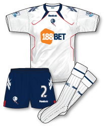
 Since Bolton ditched their two-year life cycle on kits in 2007 the designs have become ever more ‘challenging’. Prior to then you could count on Reebok producing good solid, innovative designs for the club but many of the recent kits have left Bolton fans scratching their heads and football kit fans in general bemused. The 2010-11 kits are no different, although a vast improvement on the 2009-10 strips the designs just don’t hit the mark for me. The bizarre collar design with red piping arching across each side of the chest just looks odd. Bolton have got such a great colour scheme and I’d really like to see what another kit manufacturer could do with their strips. Perhaps its time for a change?
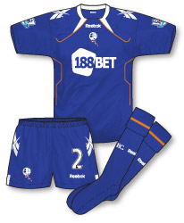
 The away follows exactly the same design as the home but in royal blue with white and red trim which works better in my view. It seems the 2009-10 navy away kit is also being retained as a third choice, creating a suite of kits that should just about be sufficient to cope with any colour clash eventuality.

Hi again,
Have to correct you on the Bolton away kit which actually blueprint (a lighter shade of royal blue and towards lilac) and thermal orange!!
awful kits,cant remember the last time i saw a decent bolton kit!
Have to agree with john b…these are truly awful…the lines from the neck look like some kind of insect antennae. Bolton seem to have had some terrible kits down the years, the last decent one being the nearly all white one from 2003. Their last 3 kits have been abominations…the barcode one from last season being possibly their worst for a long time.
I had to laugh at Bolton’s away kit description – BLUEPRINT, I mean, what the hell is that? To me it looked more like a mauve-shade of blue. Also, the shirt has what was described as “thermal orange” piping, well what is THERMAL orange? It’s just orange to me!
Keeping last season’s third kit is a little bit daft when you consider West Brom are in the Premier League this season. I suppose Bolton could get away with wearing the purple erm I mean BLUEPRINT kit.
Oh Jon you poor misguided creature…how simply you must view the world..anyone who’s anyone knows that thermal orange is a clear and definite shade in its own right, its main characteristic being that of its orangey thermalness…you know…like ‘normal’ orange, only…more thermally…sort of orange in a vest…maybe that was the inspiration…a 3 week old egg stain on an old man’s undergarments? As mere mortals we can only hope to one day gain insight into the magical world of the Reebok colour palette…
I think the marketing buffs at Reebok must have vivid imaginations. Have you seen the official description of Bolton’s home kit? Whilst the white is your usual “white”, the navy is described as “athletic blue”, which is funny considering the exact same shade on the third kit is described as “athletic navy”, and the red piping is described as “Reebok red”……. I suppose Reebok have got their own shade of red, which to me looks like any other bog standard shade of red.
Reebok still have a way to go to meet Le Coq Sportif, who were surely on something (which I might request a pint of!) when they described Everton’s new kits… oh yes, “optic white”, I bet it’s whiter than white!
Both of these kits are pretty ugly, and are very dissapointing, what is wrong with reebok? They are getting better, but are still awful, and some of the kits they have made beggar belief, such as the awful 100% Mexicanos Chivas shirt and the worst use of the template seen on the Bolton shirt, the one for RC Lens. What a shocker.
http://todosobrecamisetas.blogspot.com/search?q=Reebok
Sao Paulo, Chivas with the special Copa libertadores shirts and Cruzeiro (the home and away, not the awful yellow and black) got the only really good kits from reebok this year, the rest are just horrible. Bolton are the local team for reebok, surely they deserve a bespoke kit, or at least a template that does not look as if it was done in the last minute.
I’ve seen those Chivas kits and they are bad, and that away kit is totally pointless given the home kit is red and white stripes, not that that would bother them as referees in Mexico don’t seem to apply the letter of the law regarding colour clashes. Last season Chivas had an even uglier home kit, and their keeper wore shirts in a similar template. For a few matches the keeper wore a red shirt with grey stripes – ALONGSIDE the home kit, a seriously shocking kit clash, and the referee let them off. Madness!
In my opinion Reebok haven’t made any decent kits for a good few years.
I’m struggling to think of a decent reebok kit at all…there was the yellow liverpool away kit from years ago, the Bolton one from 03 and that’s about it. When they briefly supplied Argentina’s kit, they were just awful…but at least they didn’t incorporate the huge reebok logo into it like they did with Chile’s around the same time.
Rich, I hope you mean the 97-99 Liverpool away kit which was just about acceptable and not the 00-02 abomination!
One good Reebok kit which springs to mind is Boltons 125th anniversary kit from 02-03.
You’re missing one out there, Mark.
Rich may be talking about the yellow Liverpool Reebok kit from 04-05.
http://www.gettyimages.co.uk/detail/51779944/Getty-Images-Sport
Yeah, I don’t like the new Bolton kits. Although, I think they are at least a slight improvement on those from last season.
You make a good point, John, about it maybe being time for a change. How long have Reebok made Bolton’s kits? It seems like forever.
Is it since they moved to the Reebok stadium in 1997? I remember a time when they sponsored the stadium, made the kits, and sponsored the kits!
On the subject of the last good Bolton kit, I was a fan of the 04-05 strip.
Worn here by El Hadji Diouf – http://www.gettyimages.co.uk/detail/51805788/Getty-Images-Sport
I actually prefer Bolton in all-white.
Yeah, that was a great kit, but it was only worn once. I thought it was a wasted opportunity, a full season would have been great. More English teams should play in full tricolours
.
Bolton have had a purple away kit, it was the season 1997-98, and it was quite nice
On reebok templates, theyve came up with a few shockers in the last few years, some as bad as this (it was also worn by Penarol
http://www.oldfootballshirts.com/en/teams/b/banfield/old-banfield-football-shirt-s11978.html
This is probably my fave reebok shirt of the past few years (Untill it got plastered with sponsors)
http://www.oldfootballshirts.com/en/teams/s/s%C3%A3o-paulo/old-s%C3%A3o-paulo-football-shirt-s15779.html
And this is probably the worst shirt reebok have made, and possibly the worst football shirt ever made
http://www.oldfootballshirts.com/en/teams/c/chivas-de-guadalajara/old-chivas-de-guadalajara-football-shirt-s8779.html
Mark, SuperChico…it was the 97-99 one I was referring to. Agree with both of you re the Bolton Centenary and 04/05 ones though.
MW, that Banfield one reminds me of the terrible Pony ones from the late 90s, as worn by Southampton…the one where the top of the shirt was a giant pony logo.
In fact, I generally dislike kits where the manufacturers logo forms part of the design, except as trim (i.e. adidas shoulder stripes). It rarely looks good and usually looks like a cheap shot. Can anyone think of any decent kits like this?
Rich, at the time I thought that Russia’s kit in 93-94, white with a red and blue Reebok logo at the top, was cool, and I still don’t mind it all that much:
http://cache4.asset-cache.net/xc/79649679.jpg?v=1&c=NewsMaker&k=2&d=77BFBA49EF8789215AB089EE596C658822FC1747C66D1DAA22C62AF00B7477C178A95B424DD6DDAE
Rich – Chelsea away 90-92.
Denis, I remember that Russia kit…and didn’t like it either…for that exact reason.
Mark, was the pattern on that Chelsea away based on the umbro diamond?
Yes Rich, the Umbro Diamond was repeated large in red over a white background. Sounds horrendous but looked effective.
Mark, yeah I remember that one…my eyes!!! 😉
Does anyone know why Bolton changed to their away kit yesterday at the Emirates? Spurs have never worn anything other than White and Navy against Arsenal?
I think, Andrew, it was probably just the kit man thinking “let’s just wear the away kit, just to be on the safe side” – or something along those lines.
I think Spurs probably should change, but there is certain pressure to wear your home colours when playing your rivals, and you can just about get away with wearing white against Arsenal.
It’s a bit weird with Arsenal, as sometimes you see away teams who usually wear white, at the Gunners changing – sometimes not.
There are so many of these inconsistencies in football, as there aren’t really any set rules. Which leaves us scratching our heads sometimes, but at least it makes it interesting for kit lovers like ourselves.
Like I say, I think most of the time, it’s just what the kit men’s opinion is, and some are more liberal or, on the flip side, stricter – than others.
Maybe some kit men think the same colour sleeves are a problem – whilst others don’t.
You are right it is open to inconsistancies as Arsenal change at Bolton and always changed at Leeds, but never at White Hart Lane.