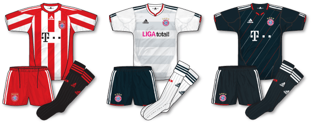
 If there’s a finer set of new kits this season than Bayern Munich’s new outfits I’d like to see them.
Adidas have really hit the spot here as far as I’m concerned with a traditional looking home kit to commemorate the club’s 110th anniversary perfectly complemented by a frankly superb away kit featuring subtle pale blue/grey bands and a stylish anthracite third (and also Champions League away) complete with alternating red, white and pale blue/grey diagonal pinstripes. Rather than including the logo of T-Mobile/Deutsche Telekom, the away features the logo of Liga Total! – the exclusive Bundesliga soccer service via Deutsche Telekom’s Entertain portfolio and mobile communications.
Fair enough there is a chance that the kits may not cover every colour clash eventuality and perhaps the white away would have looked better with white shorts but as a set I think they look great. I love the way they have taken adidas’ standard templates and really made the most of them. If I was a Bayern fan I would have to snap up all three.

“If I was a Bayern fan I would have to snap up all three.”
Being a Bayern fan myself I would skip the away jersey myself.The Liga logo is a bit too pink for my liking.An acid house like style IMO.a white away with red in the middle would have been a far more interestimng concept I reckon.
The home kit and third kit are outstanding though.I suppose 2 out of 3 aint bad.Makes up for some of those poor kit designs of the last 10 years.
At least Van Bomell will look classy when he takes the legs off the opposition now.
Will be interesting to see what next years jersey wil look like as apparently t-mobile might not be around by the time the bundesliga starts again in 2011.
Third kit is very good, away is alright but I don’t like the home at all. I hate it when they mess with stripes like that with all the angled diagonal panels cutting into them.
I really don’t like the home kit…that particular adidas template just doesn’t sit well with stripes and I totally agree with Tim. It gives me a headache looking at it.
The away kit is fantastic though…a really cool and classy looking shirt and one where a pink logo actually looks at home! I’ve also really warmed to that particular adidas neck.
The 3rd kit is nice, but I’m getting a tad bored with black kits now…seems almost a requirement to have one these days.
Am I the only one who thinks the black socks jar a bit with the home kit? Black trim should be more prominent on the shirt and shorts if the socks are to be that colour, in my view.
It was interesting how, when that kit was first worn, in last season’s CL final, it forced Inter to wear white socks, even though they’ve had black socks since time immemorial whereas Bayern change colours on a regular basis.
The away is very nice, and the designers of the third must surely have been studying Spurs away kits of the 1980s!
The dark blue hummel one Denis?
That’s the one Rich!
Think that became their 3rd kit in the late 80s…always thought it looked really dated by then. The neck was very early 80s 🙂
The black socks result from the kit being a modern interpretation of their kit from the 60s.
But in the publicity pics for this kit, the older kit shown had red socks? http://www.footballshirtculture.com/10/11-kits/bayern-munich-10-11-adidas-110th-anniversary-home-kit.html
The home looks good from the front, but the back is really nasty, as its just solid red. I cannot understand the whole “solid one colour” back, as it ruins shirts with hoops and stripes, and it just ruins kits. The new Newcastle shirt is a prime example of this, and it grinds my gears that the Mackems have a nice unbroken kit by umbro for them.
I wold love to see a full blog article on this (hint hint)
John, for me the front of the shirt is the main thing and I can easilly live without the backs being illustrated.
I see that you’ve now finished the 09-10 kits and i’m sure this is very much appreciated by everyone.
Sorry posted this in wrong forum!
Didn’t realise you were a Bayern fan Ciaran, funny the away is my favourite.
MW – totally agree with the solid backs. A big pet hate of mine.
Denis – I quite liked the jarring socks – gives it a bit of individuality IMO.
Mark – thank you for your views – I think you’re right, looking like fronts only for 10-11