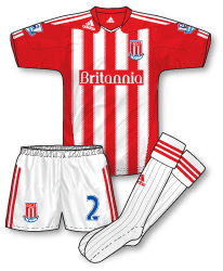
 The buzz around the Britannia Stadium when it was announced that Stoke’s 2010-11 kit would be made by adidas was palpable. Sadly the club ended up with a home strip that didn’t really live up to expectations and left many supporters a bit deflated. In my view the shirt struggles too hard to fit in with an adidas template that first saw the light of day in the World Cup, and the stripes are made confusing and messy by the addition of 2 dashed lines on the outer edge. It just feels too forced and unnecessary. The rather pedestrian minimalist neck also does nothing to improve the design. The shorts and socks are relatively sober adidas fare, with red alternative pairs also lined up if required.
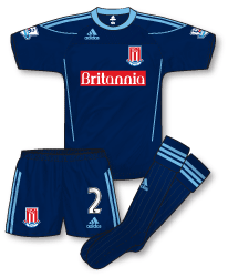
 Still, if the home is arguably one of the worst in the Premier League this season the away does perform better. Again, another World Cup template is transformed into what is a rather fetching navy and sky blue ensemble. The lopsided adidas/Stoke badge placement (caused by the chest panel) is accompanied by the ominpresent Britannia logo – would this look better simply reversed out of the blue in white with no hint of red? The shirt also features a very subtle abstract shadow pattern. Shorts and socks follow the design of the home with the exception that on the shorts the adidas logo appears on the front in its traditional position rather than on the back as is the case with the home kit.
I would guess that we will be seeing a far more traditional Stoke home shirt for 11-12.

For me the biggest issue with the home strip is the fully red back, from behind you could be watching Bristol City, personally I prefer to see a shirt with a white body and a few bold red stripes
I remember Stoke fans being angry that they still could buy the same shirt without the badge and sponsor at any store selling Adidas teamwear. They then clarified that this combination of teamwear was not gonna be offered anymore to avoid that backlash.
Still, if it feels “forced” its only because it was!
What annoys me most about the Stoke kits is that the adidas stripes on the black goalkeeper shirt and socks are white but on the shorts, which are also black, they are yellow
I agree it’s the worst Premier League kit this season but only because it breaks Stoke’s traditional white strip with red stripes on the shirts!
The alternative red shorts are only used in cups since in the Premier League a clash of white shorts is allowed. (White or black or navy shorts can be worn by both teams in Premier League matches).
I pretty much agree with the comments about the Stoke kits, I like the away, but the home is poor. It was strange seeing Stoke wearing the away kit at Old Trafford with the white and red socks from the home kit – due to the standard away socks clashing with Man United’s black socks.
It didn’t look right, and I would have thought Adidas would have provided Stoke with some light blue with navy trim change socks – as they have done with the home kit.
@3. Denis Hurley. I noticed that too. After your comment, I decided to look into it. Stoke also have an all-yellow with black goalkeeper kit, and I thought the shorts you mentioned were maybe change shorts from that kit – possibly worn with the black and white goalkeeper kit by mistake.
But, after seeing a close up picture of the black and white goalkeeper kit, I saw that there is a yellow third colour coming down from the collar and “connecting” with the trim on the shorts.
http://www.gettyimages.co.uk/detail/104679026/Getty-Images-Sport
So, the black with yellow shorts make a bit more sense than before. Although, I agree with you, it’s not really a good look.
@4. Martinos Perdikis. Are we sure about this “shorts aren’t allowed to clash in the cups” thing? I’ve read that elsewhere on the posts section of the blog, and I’m sure I’ve seen lots of shorts clashes in the FA and Carling Cup.
One that springs to mind is the Carling Cup semi final second leg, last season, between Aston Villa and Blackburn at Villa Park.
http://www.gettyimages.co.uk/detail/95897187/Getty-Images-Sport
It doesn’t seem to make much sense to allow shorts clashes in the Premier League, but not in the FA and Carling Cup.
I mean, surely it’s either a problem or not, regardless of the competition.
At risk of being controversial I quite like the home kit. I think the solid red shoulder panel housing the Adidas logo sets it off, although I agree that the outermost stripes do make it slightly fussy.
Away kit is ok at best.
the home shirt is awful…the red back!! the shorts and socks are fine.
the away kit should be reversed,sky blue with navy trim.
Adidas and stripes. Very rarely a good combination. I’d feel ripped off as a Stoke supporter with this kit. I hadn’t actually realised they had withdrawn the red and white Stricon teamwear shirt until I read the comment above. I actually think that makes it even more of a swizz; “It used to be available for £15, but we stuck a couple of cheaply made, printed logos on it and raised the price by £25.” Well played Adidas.
I really dislike Adidas’ insistance on cutting into the stripes on their shirts with diagonal lines at the bottom. They seem needlessly over-complicated in the cut too with silly panelling all over the place, and the way they position their logos – high and slanted – looks terrible.
Excellent comments as ever people. Of course, the red back to the shirt adds to the overall poor show in my opinion. I didn’t realise the full story behind the teamwear issue – it really does raise the issue of how companies should manage this sort of thing. I haven’t got a major problem with teamwear – but I do have doubts about clubs that simply change their teamwear kit every year, often selecting an older design. Teamwear or not, I feel the stripes have been squeezed into this design and would have been better suited with a simpler style. It will be really interesting to see what the club were next year.
This is an interesting dissection, which pulls into focus a wider issue, namely the relative value and status of clubs such as Stoke City to global sportswear brands.
I’d frame the partnership of being one that Stoke City, and their supporters…(prior to them seeing the design, of course), would be far more enthusiastic about than adidas. Meanwhile, you are very unlikely to see the manufacturer using Stoke in any advertising material, outside of Staffordshire.
Medium sized clubs, even those playing Premier League football, are given second class status and therefore teamwear designs, by both adidas and Nike.
The choices for these “medium sized clubs” appears to me to be to accept generic designs, but be associated with a major player in the sportswear market, or seek out a smaller manufacturer and be provided with a bespoke kit….(in theory anyways!)
A good example here may be Fulham, switching from Nike to Kappa.
I have a running top very similar to the style of the home adidas stoke jersey that i bought in 2007.The logo just across from the collar.Its not something i like to point out as a hardline Adidas fan
Theres a bit of an American sportswear feel to it which does it no favours.
It looks a bit dated and stoke arent really suited to Adidas.LCS did a decent job of them in recent years.
Surely, Bolton’s home kit is worse.
Vancanham – you make a very valid point!
Awful awful awful! I don’t like that particular adidas template to start with, but this is just terrible! Still, as vancanham says, it’s not the Bolton ‘praying mantis’ abomination!