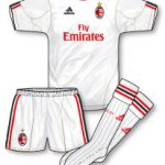
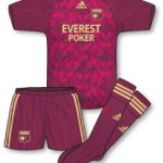
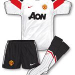
A while back I featured the home kits of the last 16 teams in the Champions League. Now with the second legs of the semi finals fast approaching I thought I’d feature the aways. Personally, I think many of these are better than the home!! Surprisingly I love the adidas Lyon and Marseille aways, the Lyon one especially is incredible. Dont’ think I’d ever wear it but its certainly a brave design. Although the trend has gone out of fashion in the UK in recent years several continental sides are still sporting special European away kits that double up as their domestic thirds namely: Real Madrid (regular away kit is black), Schalke (whose domestic change strip is navy blue, daft when you consider their home is royal blue!) and Bayern Munich (although their white away has also been worn in this season’s CL campaign).
FC Copenhagen have a complete set of unique European kits with a black change strip (their vibrant pink design a third choice).
I’ve included Spurs’ third kit here rather than their pale blue away mainly due to the fact that the navy strip has been worn in Europe this season while the pale blue hasn’t. Whether the navy is first choice European away (if that makes sense!) or not is unclear.
As far as Nike’s contributions go, the Barca away shirt, as ever, is interesting and special mention has to go to the audacious Inter Milan change jersey that features a large blue and black serpent graphic (the serpent/snake being an important symbol for the city of Milan) on the left hand side.
Kappa also make their mark this year with a fine orange change strip for Valencia.


It amazing how many teams wear white shirts, by my reckoning only Chelsea, Barca and the Goons don’t have a white jersey this season and Barca probably never will due to their rivalry with Real.
Good shout Andrew, though you might be surprised to learn that Barca have worn white in the past, as seen here against Ipswich:
http://www.gettyimages.co.uk/detail/108000576/Bob-Thomas-Sports-Photography
And just in case anybody thinks that that might be yellow, here’s a poorer-quality pic off my phone from Orbis World Cup 90
http://img339.imageshack.us/img339/7440/photo0052x.jpg
Got to love that gorgeous Marseille blue, for my money the best kit colour there is, especially the way adidas adapt it for OM. The Lyon kit is a VERY brave effort compared to what Umbro provided for Lyon, mind you I do remember that neon green Euro effort a couple of years back. Valencia’s is classy, and the rest just seem a bit tame and boring. Great job as usual, this site is rapidly becoming a “must view daily” for me!