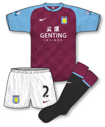
A brief glance over the past few years of Nike’s Villa kits reveals that, well actually not much has changed. Sticking to tradition, the club have retained their familiar claret shirts with sky blue sleeves in very similar designs since 2002. Nike’s kits have, in the main, topped this off with minimal, tidy necks. So in 2011, has this home kit formula changed?
 Well, yes and no. The claret and blue shirt combo remains and there is still not much of a neck design to speak of but this season sees the shirt adorned with a subtle chequerboard shadow pattern that lifts the otherwise plain jersey. The chequerboard motif was first introduced last season (instigated by the club’s chairman apparently) and has also been rolled out amongst other elements of Villa merchandise including the matchday programme.
The biggest change though with this season’s home kit comes with the socks. Gone are Villa’s regular sky blue or claret socks and in comes a rather daring black pair (trimmed with the club’s traditional colours though) in a throwback to the 1920s-1950s era when the club wore similar. I have to admit I’m a sucker for socks that at first glance don’t ‘go’ with the rest of a kit (maybe its because I’m a Scotland fan?) so I have to say I love them!! The fact that they have historical inspiration only gives them extra brownie points in my book.
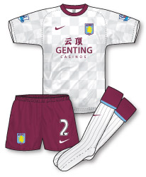
 Away from home Villa’s new change kit mirrors the design of the home in a more familiar white/claret/white combination. The shirt retains the chequerboard design introduced on the home jersey along with an identical neck and sleeve stitching template. The shorts, as with the home kit, are plain giving ample opportunity for mixing and matching with the home strip should the need arise. No surprises with the socks this time which feature an identical turnover to the home.
Last season’s sponsor FxPro have departed Villa Park and are replaced by Malaysian betting company Genting Casinos in a move designed to raise the club’s profile in the Far East. Including Genting’s Chinese logo as well on the shirt is further evidence of the club’s intentions.
With a risk of Nike’s Villa efforts becoming stale, the designs have been given an added spark of interest this year with the introduction of the black socks and for me this move has helped create a couple of good, solid strips.

I’ve watched with interest and note they have worn all claret when a change of short has been required this season.
I was also a little surpirsed that Villa wore the home kit at Man City at the weekend when previously in the Premier League there has been deemed to be a clash of sleeve colour when Villa played West Ham a few seasons ago. Maybe that was just down to Rob Styles !
Spotted that too Andrew, for some reason teams seem to be reluctant to have darker socks if shirt and shorts are same colour (bar white), whenever Rangers wear blue shorts they usually have blue socks too.
John, any chance you could mock-up what a Villa kit with claret shorts and black socks would be like?
Didnt a few teams wear black socks in the 50’s? Chelsea for one,think both strips are spot on,shame they’ll only last a season.
I love both strips and it’s nice to see different colour socks, with completely breaking with tradition.
It’d be good to see Villa keep their strips for two seasons; perhaps if they did we’d see more adventure in the strips, rather than minor variations from season to season.