My first real footballing memory is the same as that of a lot of Irish people around my age – the heady days of Italia 90.
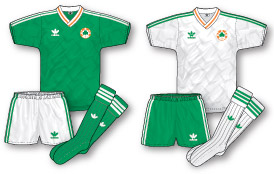 Even then, I was fascinated by the kits, and there are few things better than a World Cup to help such an interest develop. Having been introduced to the concept of home and away kits by my father at my first Cork City game shortly before Italia 90, I was surprised to find Ireland decked out in white shirts and green shorts against the Netherlands and Italy, when neither of them played in green.
I was told that, as the World Cup was being beamed around the globe and not everybody was as lucky as to have colour televisions, it was necessary to be able to tell teams apart in black and white. Of course if I’d simply waited a few weeks until the start of my first season supporting Arsenal, I’d have come to see that an “away kit” appeared to be just that, as the Gooners were in the habit of changing for nearly away game. But, in any case, I think I’d have been too surprised by the fact that Arsenal’s change strip was yellow and navy rather than white and red.
Having seen that Ireland’s away kit was simply a reversal of the home (bar the neck, which stayed the same), I had simply assumed that all teams did this, and that Arsenal’s away would be white with red sleeves, not considering how such an outfit would not really alleviate a clash.
Since my childhood, I’ve come to see why yellow and blue are the first choice of many as Arsenal change colours, and I now favour them too, but in general my preference is still for and away kit to be simply a reversal of home colours, or at least use of the same two or three colours in a different order, as a way of retaining the club’s identify.
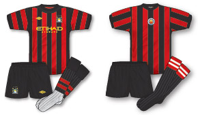 Of course, teams other than Arsenal have also embraced change colours that bear no relation to the home and they have gradually developed to be seen as the club’s ‘ideal’ away choice, such as red and black for Manchester City (despite them being Manchester United colours) although a case could also be made for maroon that City have also worn on several notable occasions.
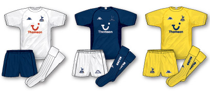 Similarly, yellow is often considered the regular away strip for Tottenham (though I have to admit I loved their set in 2004-05, when yellow was third choice and the away was the exact opposite of the home).
When worn on famous occasions, these change colours take on a personality of their own – the 1971 and 1979 FA Cup finals, as well as the 1989 league decider, have ensured that for Arsenal, though why completely different colours are chosen in the first place is something of a mystery. Football seems to stand alone in this regard. In the main American sports, home and away uniforms (the term is taken literally there) always have the team colours, it’s similar in Gaelic football and hurling (see www.prideinthejersey.com for more – please, I need the hits!) and the approach taken in Australian Rules can best be understood by this link http://www.collingwoodfc.com.au/tabid/5586/default.aspx?newsid=105726.
One possible reason for the way it developed in England was that originally in the FA Cup both sides were required to change in the event of a clash, so if teams’ change colours were similar too then a different option was required. It was due to this that Arsenal wore yellow/gold for the first time, against Liverpool in the 1950 final, but it wasn’t until 1968 that yellow and blue were decided upon in a more permanent manner, as the Gunners had to stop using their navy away, due to the FA outlawing the colour as it clashed with referees.
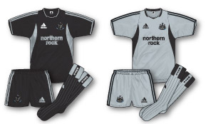 Some clubs, Newcastle United for example, tend not to have a ‘favourite’ away design (one could say yellow and green but to the best of my knowledge they have not worn those colours together since they had Umbro in the early 1990s). However, The Toon have utilised another of my favoured approaches to change kits when, in 2003-04, the away and third were the opposite of each other: black with silver trim and silver with black. This is something that can work when the designs are nothing like the home, for example Arsenal in 1999-2000 (yellow with navy and navy with yellow) but something like the range of kits Crystal Palace had in 1990-91 was perfect in my view: the home was the usual stripes while the away was a similar design in all-blue with red trim and then the third, using the home shorts and socks, was all-red with blue.
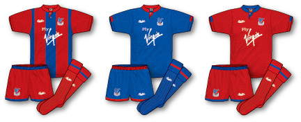
Such a philosophy doesn’t always work – witness Bristol City having purple and green change kits in 1993-94 – and if it is being done, then clubs should take advantage of the mix-and-match opportunities rather than doing something like Liverpool did in 2007-08, when they had two pairs of black shorts with white stripes and red trim. You’ll notice that this article hasn’t yet dealt with ‘out there’ away kits, where the designers let their imaginations run riot. Well, I’ll do so now – I absolutely hate them!

Good article and some interesting points.
However it would be very interesting to hear about why you hate the ‘out there away kits’
Interesting article, Denis.
Although, I have to say, isn’t there a flaw in the three Crystal Palace kits from 90-91?
I mean, what do they do when they play a team who wear red and blue stripes?
Interesting point EricGeneric – never shy of adopting a multitude of kits, Palace also had an emergency yellow and black fourth kit that year!
I would have a all white palace 4th kit (with maybe a thin red n blue sash) as it has a strong history with the team and it could even be a special “cup home” kit also/as well… to get it used more often as Barcelona don’t visit selhurst often! as for my money palace are the only club team other then ac Milan who should be allowed to get away with 4 different shirts as both teams would only use 3 pairs off shorts and socks with them… in ac Milan’s case my ideal kit cupboard would have the red and black home stripes kit with white shorts and black or white socks (white only though for European home games though and all Milan derby matches) and then away kit= all white with red n black trim 3rd kit = all black with red trim and 4th kit= all red with black trim (this would only be used away to juventus or as a emergency keeper kit) in both clubs cases only two pairs of shorts and socks would get used regularly both with and without home shirts and the 3rd pairs would only be used with the 4th shirts (white palace /red ac Milan)
Hi Thomas, thanks for the comment. Unfortunately space constraints meant that I couldn’t go into further detail – my original piece had to be trimmed by John due to my overwriting!
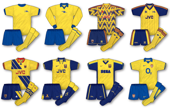
Basically I just feel that away kits should be functional items rather than a canvas for designers to let their imaginations run wild. Newcastle’s away from 1997-98, the Arsenal brusied banana/tractor tyre above and Chelsea’s 1994-95 effort are just a few of the ones that really annoy me!
I’ve always thought that the easiest way of avoiding colour clashes (which is the purpose of away kits after all) is to take a colour that very few teams wear as a home kit, probably yellow so apologies to Norwich fans and make this colour mandatory for all away kits. No need for third kits and never a colour clash.
In the 70s, I remember on rare occasions Motherwell would wear their away kit at home. In Scotland, it appeared to be standard practice for the host to change if team colours clashed. I wonder if this happened anywhere else?
It’d be common practice in amateur and schoolboy leagues in Ireland anyway, the logic being that it’d be easier for the home side to have a spare set to hand if a clash did occur.
It’s also the practice in the Six Nations!
@Mark Jessop.
All teams having to have a standard away colour would be pretty boring, wouldn’t it? Especially for kit lovers like ourselves. Also, away kits, colours and designs, are a part of a clubs history and tradition as much as the home kits, and having a “standard issue” type of thing would be a horrible idea, in my opinion.
In my opinion, I think, in this day and age, every club should have a home, away and third kit. And surely it’s not too hard for kit designers to come up with three kits that can avoid any possible clash.
Infact, you very rarely see a kit clash problems with teams who have three kits. It’s usually only a problem when a team only has a home away kit.
Eric, I take your point about it being boring, but on the other hand it could just work the other way.
Just think how imaginitive and creative kit designers would have to be if they only had one colour to work with year after year!
Besides it works in American Football where all change kits are White
Your point about American football is interesting Mark – generally teams have coloured home jerseys and white aways but the Dallas Cowboys began wearing white at home in the 1960s as their owner wanted fans to see different colours rather than blue v white every week!
Re Willie in post 6 asking if other teams wore there away kit at home, I remember Queen’s Park having to wear their red/black away kit at Hampden instead of the black/white hoops in both home games against Dumbarton in the early 80’s, as Dumbarton wore their home kit in both the games, which was all white with black/gold band so not sure why they just didnt wear their away kit in both games at Hampden, which am sure was gold shirts, black shorts/socks which wouldnt have clashed with QP’s black/white hoops white shorts/socks.
Arsenal used to wear their away kit at home to Nottingham Forest as a mark of respect for Forest donating their first kit, but I’m not sure when this practice stopped
Great article Denis, great reading for a fellow Arsenal and Ireland man such as myself. Don’t you think it’s annoying when teams (Chelsea and Ipswich spring to mind) wear home and away kits that aren’t hugely different, both of them wearing blue (obviously) at home whilst wearing black away, maybe it’s just me but I think there should be more of a contrast, possibly White or yellow – both have used them in the past. By the way ‘Pride in the Jersey’ is an excellent site, both for GAA fans such as myself and all readers of this site.
Hi Ronan, many thanks for the kind words!
It is a little bit irritating alright but it wouldn’t overly bother me, although I can see why some might find it annoying. In 2002-03 (I think anyway, sometime around then), Chelsea’s away was a very dark navy, officially called ‘midnight blue’, though it was sufficiently different to avoid clashes with blue kits
With regard to the Crystal Palace kits of 1990. It doesn’t work for me. They would still need a fourth kit if they played Barcelona for example. If you have a striped sheet you must have a third completely contrsting colour. Even then there would be problems so a third kit of another colour is needed.
I know its happening more often that striped teams can play against each other eg Sunderland/Newcastle where they share a colour but i don’t like it.
I do like it when away kits compliment the home shirt eg the shorts and socks work seemlessly. There is no need for clubs to have more than two colours of socks and shirts.
For example. in a perfect world i would like ti see man utd in the classic red, white, black. with the away as white, black, white. A simliar styled black shirt would then form a perfect set. The only potential clash being against the south american team who wear red, white and black stripes. can’t remember there name now!!!! But three colours of stripes is ridiculous
Speaking as a leicester fan white has been worn as an away kit every 4 to 5 years or so on average so thats one club that stays somewhat faithful to the original home colours.
admiral did a green and gold away kit for leicester in the mid 80s but it was considered unlucky so not kept for very long.yellow has been either a 2nd/3rd kit for the club also.
Denis clubs like Arsenal have a large fanbase so sticking to a red design would not be profitable in the long run.it may be easier for lower league clubs to stay within the boundaries of home colours for away kits due to a smaller pool of fans.
The Nikes and Adidas of this world would probably be crucified if they put off simple reversals of the home kit regularly whereas newer companies such as burrda would be hammered for an “out there” away kit early on.at least umbro seems to have learned a bit in this regard from the 90s too.
Nike wouldnt be known for their straightforward styles either.very few would have seen the air max range becoming the phenomenom that it is now.
As Eric said all teams having a similar away kit would be boring.
I see your point Ciarán about changing away colours for commercial reasons (commerce gets in the way of most of what I want in the world!), though it’s worth noting that Milan are a notable exception to this rule, as are most national teams
Hi Chaps
To add this debate. Such was Keith Hill’s vice-like grip at Rochdale that he was allowed to have the final word on our kits. No idea why but he went for an all-lilac affair which didn’t contrast at all with our blue shirts so much so that at Macclesfield we had to wear white training shirts (with numbers/names printed on) while less fussy refs, like the one at Chesterfield, allowed lilac v blue…
http://rochdaleonline.co.uk/uploads/f1/news/img/2010413_165332.jpg
The nadir for that kit was a night match versus Bury who were wearing sky blue/chocolate at the time and it was impossiblel to differentiate under the floodlights.
Rather ironically he chose a white shirt for this season just before he left, the irony being that we’ve only been able to wear it once due to so many white/white stripes teams in the league. An emergency black kit was introduced for the opening game v Sheff Weds but this kit has never been available meaning that fans who bought the white kit have basically bought something that’s virtually redundant.
It’s been rumoured that the club has finally learnt its lesson and something yellow will be used next season.
Up the Dale!
Good article.
West Bromwich Albion have a relatively good record with contrasting kits, but keep getting into a situation where due to results the third kit becomes the preferred choice of the players, so actually becomes the first change option during the season.
This year the club went off at a tangent with a cyan blue away shirt, but that’s only been used once in the league at Swansea. We lost and it hasn’t been seen again in favour of the all red ‘limited edition’ third kit, which is actually the same as Swindon!
On Saturday we wore stripes at Stoke, despite the cyan/navy/ navy option offering a complete contrast to Stoke’s stripes. When they played at the Hawthorns both teams wore stripes with white shorts and different colour socks. It was not easy viewing from the stands. At least on Saturday the Baggies used their navy shorts which helped.
In reference to the Arsenal habit of using their away kits often, is that a result of never wearing anything other than white shorts with their home shirts, while the likes of Man United happily wear black shorts with their red?
That’s seemingly the case Statto, Real Madrid are the same, never ‘sullying’ the all-white look. Arsenal did wear red change shorts for a time in the 70s, including at home to Southampton on Boxing Day in the 70-71 double season, as the pitch was covered in snow: http://www.youtube.com/watch?v=5XarZj2eehc
How are we sure those shorts are red? I take it there are also fan testimonies stating that?
Arsenal of course are happy to change their socks regularly – like United – but some teams rarely do. We’re correct in thinking that clashing socks are generally considered a bigger issue than shorts aren’t we?
Have Real ever worn differently coloured socks with their home kit? I know l’OM occasionally do (Chelsea away last season for example).
A personal favourite is England in white shirt, white shorts and red socks (Barnes vs Brazil). In fact, with their all white 09-10 kit there were change shorts (navy) and socks (top half red, lower half white) – the latter I don’t think was ever worn.
For example. in a perfect world i would like ti see man utd in the classic red, white, black. with the away as white, black, white. A simliar styled black shirt would then form a perfect set.
Perfect to me stuart but money talks!! Im the mid 90’s United had 3 kits in the same season all with black socks! all with different trim.
Exactly, john b, that’s the killer one.
Was discussing with Denis the new Brazil kits. Two pairs of blue shorts, and if they need to change socks (for the away versions) when wearing home kit they’ll also make a blue for blue shorts change because the away shorts go better with the away socks.
You follow? Me neither.
Yeah Jay29ers, in the book Seventy-One Guns it mentions that the shorts were red, I read the book before I saw the clip!
I also seem to recall going over to Loftus Road in the late ’70’s / early ’80’s and we turned out in red shorts. I think it was a Friday night game if I remember rightly.
Real Madrid didn’t wear white socks until the mid 50’s just as their dominance of the European Champions Cup began, but that was probably down to white/light-coloured socks being rare up until then.
You can see some old team photographs for yourself on this site: _
http://www.corazonblanco.com/wiki/Las_Plantillas_Del_Real_Madrid
However I don’t think Real have worn anything other than white shorts and socks with the home shirt. I do recall one of their goalies, I think around about 2006, wore the home shirt with black shorts and socks for an away game at Real Betis – a peculiar choice given Betis’ green and white stripes effected Real’s decision to wear their away kit.
Interesting that Real wore coloured socks as late as that.
Would love to see a picture of the gk wearing white shirt with alternate shorts/socks. Had a quick look on Getty but couldn’t find anything.
I can’t find a pic either, but certainly found a (rather grainy) video of Real’s GK wearing the home shirt with black shorts and socks.
http://www.youtube.com/watch?v=NzyWPkbKIKg
It took place in the first leg of a Copa del Rey game at Betis in the 06/07 season. Casillas wasn’t in goal so I presume it may have been Diego López (now of Villarreal).
In the La Liga fixture earlier that season at Betis, Casillas wore a dark purple outfield kit (3rd kit) whilst Real wore their black change strip. A bit of an odd choice considering the lack of contrast, plus he had a yellow and a gold jersey available.
BTW looking back at my previous comment, it looks like Real did wear navy shorts and socks with a white jersey in the 20’s and 30’s, but I meant to put they hadn’t done it in modern times.
Really loved the article.
Me too, I have my first football and football shirts memory in the days of Italia 90. I’m from Rome, and in 1990 I was child, but I remeber my parents going to the Olimpico to watch Italy matches, including the one against Eire.
My football shirts passion was born in those amazing days, with all the newspaper and tv programs talking about football.. the same passion that led me to write on an Italian website and to join a private TV program all about football shirts. Here you can find the one about Man Utd shirts.
http://www.youtube.com/watch?v=ZSKHZyR-JmU
Talking about awy kits, I use to classify them into two categories: English style and Italian style away kits.
The first as you said has nothing to deal with the home kits colours, while the Italian ones use to be mainly white with team colours trims.
Actually, I think you’re mixing up the yellow/gold jersey with the Spain goalkeeper kit in 2006/07.
In 06/07, Real Madrid had a black goalkeeper kit, and a light blue goalkeeper kit. Also, as you said, they often used the outfield third purple kit as a goalkeeper kit that season.
You would have thought they would have just used the light blue goalkeeper kit against Betis.
http://www.gettyimages.co.uk/detail/news-photo/real-madrids-goal-kepper-iker-casillas-celebrates-at-the-news-photo/72647911
I’ve just found this site and love it to bits!
As a Port Vale fan, we have had Vandanel producing our kits for several years, and bar a black one which sold really well last year, they have been uninspired designs for our home and away kits. A couple of years back we had black and white stripes as our home shirt and then ended up with a black away shirt with white pinstripes!
http://www.port-vale.co.uk/javaImages/ef/6e/0,,10381~3698415,00.gif
http://www.port-vale.co.uk/javaImages/d0/57/0,,10381~6248400,00.jpg
This year’s was an all grey affair with a bizarre collar that look like it had been stitched on backwards:
http://farm4.static.flickr.com/3404/5806224771_f0f2342338.jpg
With our club now having a new owner after administration there’s talk of us having some generic Nike/Adidas teamwear, which I think would go down far better than some of these…
I remember that season Port Vale also retained the previous away shirt as a third strip, which just happened to be navy, which didn’t solve any kit clash issues at all. Not least when they played Notts County and their black plain-backed Nike shirt.
I had to find this blog post because, has anyone seen the new Liverpool third kit? Not just is the kit a travesty, but with the away strip being black, what is the point of a third jersey being a rather dark and dull shade of mauve?
That was my first reaction upon seeing it John, and no amount of people saying, “Well actually it’s purple” is going to make it solve more clashes.
At least the rumoured orange shorts did not materialise
i have seen pictures of a game at Colchester. notts county were made to wear colchesters away yellow shirt with their own black shorts and socks because the ref thought there was a clash(blue and white stripes v back and white stripes). this game was in the late 90’s. also i am sure i have seen a picture of david oleary wearing red shorts with arsenals home shirt sometime in the mid 80s.