Click here to buy the new England shirt
Isn’t it funny how a New England kit always generates so much interest in the football world? Even as a Scotland fan a new England kit always gets my old heart rate up a bit just to see what the Auld Enemy will be wearing as they compete in some tournament or other while us Scots stay at home. Again.
This design is Nike’s first REAL England kit, the previous one acting as sort of a stop gap following the end of the FA’s deal with Umbro. I actually met up with the Nike design team some months ago now to discuss how the new shirt would look so I had a little more interest than usual in this new strip.
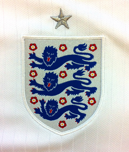
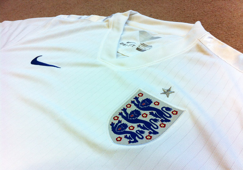
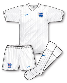
Unveiled stylishly and simply, the new strip reflects the launch. On first glance I found it a little underwhelming but, like many good kits its a slow burner and its elegance and sophistication grows on you. Constructed from a simple pure white Dri-Fit fabric (thats softer than previous and incredibly comfortable) that is, in true Nike style, environmentally friendly. Any embellishments on the jersey are subtle (perhaps too subtle?) and consist mainly of gorgeous silver satin strips on each shoulder and a fine tonal pinstripe. The England badge looks superb, the outline has been removed, giving the crest a more refined look and makes it less ‘slab-like’ than previous England crests. Plus it includes a satin sheen that brightens under UV light.
Another key feature is the swish wrapover V-neck, that ends ‘flat’ without an apex in a design that’s reiminiscent of early 90s outfits. Opinion seems to be divided about the neck, but I think it looks wonderful.
The shirt fit is snug though very flattering (even on a more ‘well-nourished’ chap such as myself) although given that one source of inspiration is the the white crew-neck airtex jersey Bobby Moore and his compatriots wore in the last Brazilian World Cup in 1970 it might have been interesting to resurrect and replicate the shorter sleeves of that particular shirt. In line with the 1970 strip, the shirt is paired with slim-fitting white shorts and socks. Personally I’m not overly keen on the single colour kits that have appeared in recent years but contary to popular belief this isn’t the result of a FIFA directive. True it may be influenced by the organisation’s preference for single colour outfits (especially for the benefit of TV viewers) but it is primarily a stylistic trend.
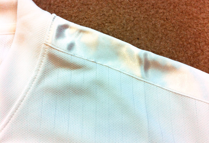
The more you see the shirt, the better it gets. On the pitch its simplicity will allow shirt numbers and sleeve patches to be added without contributing to visual clutter and off the pitch the little elegant touches will appeal to the replica wearing supporter.
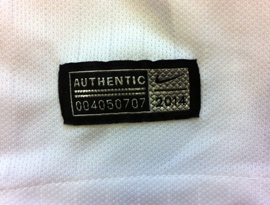
Plus, if you’re a collector and want the top of the range player-spec version you can buy the authentic edition. Don’t be decieved by the frothing of the mouth of the media hyperbole, the replica versions are at normal replica prices.

What exactly is the difference in the replica and player spec? So for a whopping great sixty quid you can’t even wear what the players are weaing?! Its ridiculous. Nice shirt but you’re being very kind Jon.
A good review. I was equaly underwhelmed when I saw it first, though I’m still not a fan of the reflective strips on the shoulder, maybe that’s more for cycling attire?
The shirt is reatiling in John Lewis for £60. Whilst I know you can get it for less, shirt prices are creeping up again. Although the cleanness of the white is notably an attractive aspect, I still think other Nike kits look a bit more special e.g France home and away. There has also been too much tinkering with the badge on recent kits.
I won’t get the shirt unless nike start selling along sleeved version.
Thanks Andrew – I quite like cycling attire!
Didn’t realise there was no long sleeved version Scott
I’m sorry I just don’t agree John, I find this kit to be deeply underwhelming, lazy and cheap-looking. I just don’t understand why the badge isn’t given full-detailing as on the away players’ version, and as on the previous Nike home strip. Instead it is rendered flat and looks accordingly cheap.
There are, however, some things to like about the shirt; the collar is nice, and the shadow striping is a nice touch.
It’s a personal thing, but I’d just like a little bit of trim – something similar to the Mexico ’86 shirt? I realise this edition opts for the white/royal combination instead.
Finally, I’m not a fan of the numbers. There’s simply nothing memorable about them; too modern and absent of inspiration.
I have not seen any long sleeved shirts listed in any on line sports retailer’s websites other than the goalkeepers shirt. I would get one if nike sold them.
If the default shorts were blue, I’d think it was a fine kit, but I feel that it need a few more accoutrements with the white shorts. A touch of red certainly wouldn’t go astray
Fit is too baggy – I saw a kid wearing it a couple of weeks ago and it swamped him. Think it’s because the collar is wide – to me it looks like an American football shirt in fit.
Now, the Germany WC2014 shirts ARE things of beauty – especially the away.
Totally with agree with both your verdicts Denis and Martyn!
Nick, Denis, I do agree with you regarding extra trim. I’m all for decoration at the moment and I think the design could do with a little extra colour in some way. As Denis says the lack of blue shorts accentuates the issue
Hello Ian – I think to many extents replicas have never been EXACT copies of player jerseys. There’s always been differences in fabric, construction, badges etc. it’s just now, and for the past few years, sportswear companies have decided to make these exact player spec shirts available. It happens a lot in rugby replicas too. The New England shirt is the first time I’ve seen these player spec shirts actively marketed, they generally have appealed to the collectors market rather than just fans.
Navy shorts and red numbers please,still not a patch on anything umbro did in the 1980’s!
WC 2002 still the best England home shirt Umbro ever did IMO. England home shirts always look better with liberal amounts of red and navy. At least adidas are doing challenging, colourful ‘one colour’ strips – Nike’s are all too plain for me, and Puma’s (apart from the African sides featuring interesting shadow patterns) aren’t enough of a progression from the last set of templates. But adidas are doing really interesting shadow patterns and trim – apart from Germany, the Argentina and Spain home and away kits are nice too – love the black and yellow Spain away.
I agree with John B. Standard Red numbers (not the special font designed specifically – what a waste of time and money!), navy shorts.
The “all in one” FIFA colour scheme regulations will make life easier for “The Subbuteo” people !
As for would I have one ?
No to go and spend my hard earned dosh but delighted if it came as an early Christmas present.
Speaking of Fifa directives… http://www.mirror.co.uk/sport/football/world-cup-2014/england-forced-wear-all-white-kit-3516935
England can’t wear the away kit (red/white) against Uruguay (light blue/black) because it clashes with the officials’ kits.
I especially like the article’s implication that Fifa did this to help its friends at Adidas by undermining Nike! (Since there’ll be no publicity for the Nike away kit in the 1st round.) Seems pretty far-fetched.
Btw John, it was Mexico in 1970, but it *was* a Brazilian World Cup in every other way. Speaking of hot climates, have you ever heard of football teams deliberately picking white kits for hot weather? Apparently they retain less heat, and American football teams in hot cities like San Diego sometimes choose their white away kits at home. And I guess it works for cricket, or it used to.
…And then I remember the World Cup is during the Brazilian wintertime. D’oh… Well, let’s imagine it was summer: http://sports.espn.go.com/espn/page2/story?page=lukas/050919&num=0
Nike have given France a traditional blue-white-red strip (well navy) so there’s no reason England couldn’t have had navy shorts, although in practice FIFA would probably make them wear white in each group game anyway.
Uruguay seem to have ignored the FIFA dictat completely, as their home kit is sky blue-black-sky blue and their away kit is all white. First time I’ve ever seen sky blue described as a dark colour.
Totally agree James, and the fact Spain have to introduce a new white third kit to play against a navy holland kit in their first group game is taking it to far, FIFA are dictating too much now and are spoiling it for some fans. Some teams seem to be exempt from these rulings as you’ve said light blue home shirt with a white away kit for Uruguay, will be interesting to see what happens if they come up against Argentina as they have blue away kit to accompany their blue and white home
Well, they’re going to have difficulty shifting this kit now, aren’t they? There, I said it!