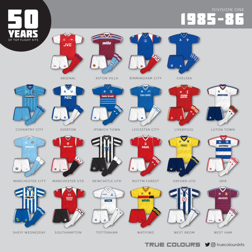
It may just be me, but I feel that after a few years of superb strips, there was a slight drop in quality overall this season.

Midway through the 80s and the First Division included a number of kits that only lasted one season, including Chelsea and Everton who were both coming to the end of their deals with Le Coq Sportif.
Speaking of deals, the real big one here was Liverpool’s switch to adidas after many years with Umbro. The German sportswear giants smashed it with one of the best Liverpool kits ever.
There was not a collar in sight…every team, bar two sported a v-necked shirt, with these two sides featuring a wrapover crew neck. The modernity of the 80s was in full stride.
The manufacturers tally this season was:
Umbro – 8
Adidas – 7
Le Coq Sportif – 2
Patrick – 2
Admiral – 1
Hummel – 1
Henson – 1
Arsenal – No change.
Aston Villa – A new arrival to the Division, Icelandic firm Henson, kitted out Villa this year. A curious design, the shirt included a sequence of bars across the chest and multi-hooped socks.
Birmingham City – Newly promoted Birmingham City sported a bold new Patrick ensemble with white and red shoulder ‘pads’ (so 80s!). The shirt stuck with Patrick’s familiar centrally placed badge.
Chelsea – A beautiful Le Coq Sportif kit went for a much more elegant and sober all-blue look for Chelsea. The fabric featured repeated shadow patterns of the LCS logo. Sadly this shirt, which was sponsorless throughout the season, lasted for just one season.
Coventry City – No change apart from a new shirt sponsor, Elliotts. The third sponsor in three years for this kit.
Everton – The Toffeemen’s last Le Coq Sportif kit featured all the cool design elements featured on the Chelsea shirt but topped everything with a rather unorthodox large white chest panel. It was a very controversial jersey for its time.
Ipswich Town – No change apart from a new sponsor, Radio Orwell, who replaced pioneer.
Leicester City – A great design for Leicester courtesy of Admiral introduced shadow pinstripes to a slightly lighter blue shirt. You couldn’t help but get the sense that Admiral were just a year or two behind everyone else at this time.
Liverpool – Massive change at Anfield with adidas producing a fantastic new kit for the Reds. Hints of yellow really lifted the red and white and the shirt featured shoulder three-stripe trim and repeated Liverpool badge and adidas trefoil shadow pattern. A classic!
Luton Town – No change.
Manchester City – City were back in the top flight and were wearing a new Umbro outfit in an incredibly pale shade of sky blue…made even paler by the silky fabric chosen for the garment. A wrapover crew-neck and shoulder piping completed the design.
Manchester United – No change.
Newcastle United – No change.
Nottingham Forest – No change.
Nottingham Forest – To mark their arrival in Division 1, Oxford replaced the bright royal blue and yellow of their previous kits for a suave navy and pale amber concoction. Computer company Wang as sponsors brought a titter from schoolboys.
Queens Park Rangers – A sparkling new adidas creation introduced a strong red v-neck and cuffs to the familiar blue and white hoops. Red, not blue, trim decorated the shorts and socks.
Sheffield Wednesday – No change apart from a new sponsor, Finlux, a TV and video company.
Southampton – The standard new Patrick template (as also worn by Birmingham City) was also introduced at the Dell in a fetching red, white and black colour way. No stripes though…
Tottenham Hotspur – A switch to Hummel brought with it a stunning new design, the likes of which had never been seen in English football before! A complex arrangements of chevrons and pinstripes decorated this all white Spurs kit.
Watford – Bright and confident from Umbro introduced a red and black chest panel with green Solvite logo and multi-trimmed v-neck and cuffs. A beautiful shirt.
West Bromwich Albion – No change.
West Ham United – An elegant and sophisticated new adidas strip saw heritage discarded in favour of an all-claret shirt with fine sky blue horizontal pinstripes.
An about-face from the previous season saw Liverpool finish top and clinch an impressive double with an FA Cup Final victory over Everton who also finished second in the league. Ipswich, Birmingham and West Bromwich Albion were all relegated.

Nottingham Forest – To mark their arrival in Division 1, Oxford replaced the bright royal blue and yellow of their previous kits for a suave navy and pale amber concoction. Computer company Wang as sponsors brought a titter from schoolboys.
I spent ages looking for Oxford
’85-’86 produced a good roster of design – certainly when compared to the homogeneity routinely churned out by Nike today, for example!
As a West Ham supporter, the home and away kits of that season will go down as classics, based as much on the near miss in the First Division Championship wearing them as on the design. The psychology is interesting here I think; if the kits had been worn in a typical Irons season – mid-table to relegation fight -then no doubt it would have been dismissed as very average – after all it didn’t even have blue sleeves!
I thought it was a great year of kits. There is not one bad one. Not often that you can say that.