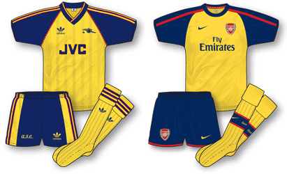
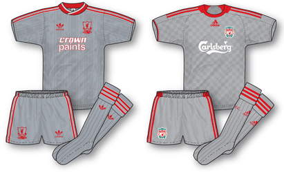
Despite many people’s negative responses to the forthcoming 08-09 kits, I think some great designs have emerged. Two of my favourites; Arsenal and Liverpool’s new away kits, are both heavily influenced by strips worn by the teams in the late 80s. The end of that decade was not necessarily a golden era for football. Interest in the game had waned somewhat throughout the period and the tragedys of Hillsborough and Heysel had cast a shadow over the sport in general. Fans did not return to the terraces in their droves until after Italia 90 where a Gazza-inspired England side rejuvenated the game. There was still high drama in the sport during this era however, none more so than Arsenal’s incredible win over Liverpool to win the 88–89 title.
 The Arsenal 08-09 away kit is a real gem and is based on the classic strip worn that fateful evening at Anfield when the Gunners clinched a last gasp Division 1 title thanks to Mickey Thomas’ late goal. Nike have done a great job in reviving the design, changing it just enough to make it contemporary and unmistakably theirs. Its accompanied by a brilliant ad poster as well. I love seeing teams in traditional away colours and although for many the definitive Arsenal away colour scheme is yellow and royal blue, for me this yellow/navy/ red palette is 100% Arsenal thanks to George Graham’s late 80s side.
 Anyone who has read TRUE COLOURS will probably pick up on the fact that I am no fan of grey away kits. Having said that I do really like the new adidas Liverpool away which revives the club’s ‘grey’ period of 87-91 which, coincidentally occured during adidas’ first tenure at Anfield. It is the first time since then that the club have worn a grey kit and it really seems to work with the red livening up the strip well. The shirt, which follows a basic template introduced in Euro 2008 features a subtle chequerboard pattern – a theme introduced across all Liverpool kits this season.

The new Liverpool grey kit reminds me more of the second version, which had the diamond effect on it. Although I quite like it, I’m surprised they’ve used white for the squad numbers and sponsor’s name. As you note in your excellent book, white on grey isn’t very visible and they changed to red on grey fairly sharpish last time round.
It ties in with another blog post, but Liverpool are getting through away kits too quickly. It’s got to the point where last season I wasn’t even sure what the official away kit was. The rather smart white & green one from Adidas’ first season back seemed like it was hardly worn.
Hi John,
I have to say I’m not fond of this new grey kit of Liverpool’s at all. I think it’s the checkerboard shadow-pattern that spoils it for me. If that was replaced with a less intrusive shadow-pattern, it might have stood half a chance of succeding, but sadly it doesn’t, for me.
Hello Ned – I do have an issue with the speed of kit changes as well – see my other blog post on 2 year kit lifespan.
Incidentally, speaking of grey kits, what do you chaps think of Newcastle’s new third kit? I believe its actually silver – why is this ‘silver’ and Liverpool’s ‘grey’ I wonder?
Unfortunately, now that I’ve seen the grey kit in action, I’m giving it the thumbs down too. It’s a shame as I was fond of the 80s grey kit in its day. Some of the red trim looks unpleasantly shiny and the checkerboard pattern doesn’t work for me. It looks more like Charlton’s grey kit of the same era. I think the dark green European away kit (and how many times will that be worn?) works rather better, although the visibility issue raises its head again. The retro green goalkeeper’s outfit is a nice touch though.
Reviewing some old tapes the other day, I was surprised at how crisp the 1991-2 Equipment strip now looked. Clean, sharp lines and much more ‘red’ than I’d appreciated at the time. The 1993-5 ‘ribcage’ effort remains a low point in my eyes.
I’ll reserve judgement on Newcastle’s silver effort until I’ve seen it properly, but it looks like a more successful effort than Liverpool’s in the pictures I’ve seen.
I love the grey kit. I’ve been very disappointed with liverpool kits in general ever sinve they introduced that maroon one with the ludicrously thick V neck (as sported by Stan Collymore). Speaking of retro, I’d like to see a return of the old V neck with crossover lines…as seen by the likes of Everton circa 1987.
John – what about the 70’s influence on this season’s Palace kit?!
Good point – although I like the idea of bringing back the sash (thats how I remember Palace when I was growing up) I do think mirroring the adidas kits might have been better. The Errea logos look a bit clunky to me. As you are the Palace kit expert what do you think?
Ned – I agree with you about the ‘ribcage’ kit, it was a step too far in my book. Still undecided about the first set of adidas equipment kits as well. I think Newcastle’s silver kit is a bit of a disappointment – seems a little inspid to me. I’m actually not a fan of the purple effort either but normally I really admire the clubs change strips.
I wonder how many more times we’ll see Liverpool’s grey kit, given that they had to wear the home shorts & socks with it against Arsenal? It looked horrendous.
Ha! You’re right, it was a bit of a mess wasn’t it? Unnecessary as well – the grey shorts hardly clashed with Arsenal’s white did they? Especially as the weekend the Hull v Sunderland game saw both teams in black shorts.
Some people I know at work (all Reds) were wondering why Liverpool wore the home shorts and socks with the grey shirt, and even I was baffled. Apparently the referee requested Liverpool wore that combination of kit, but it’s odd considering at Aston Villa earlier in the season, Liverpool wore red socks with the grey shirt and shorts.
If grey and white were too similar, it would have caused a problem at Sunderland on the opening day of the season – but they wore grey. However I have a feeling this weekend at Stoke they could even opt to wear the green third strip usually reserved for the Champions League.
And looks like I was spot on – Liverpool are indeed wearing the green strip tonight. To be honest though I’ve always thought of them wearing green as something to do with their sponsors than anything.
I think you’re right Jon, personally I hate seeing the club in green. Of all the colours in Liverpool’s ‘palette’ its the own I like the least. What annoys me is that the club insist on calling it a European kit – why they don’t just admit its a THIRD kit!!!
Its funny though about the grey kit at Arsenal – I really don’t think theres a problem between grey and white clashing. Things seem to be getting a little out of hand!
It’s all to do with the marketing bods, seems as if the term “third kit” isn’t at all appealing because it’s the kit which very rarely gets any use. Chelsea have done the same with their yellow strip this season, branded it as a “European kit” yet have used it domestically on two occasions this season because of their opponents wearing navy.
I know a number of Liverpool fans who regard the green as unlucky, come to think of it they’ve never really had any success whilst wearing a green kit, ever since the first time they wore the colour in the 91/92 season.
Jon, you’ve proved my point with the Chelsea story. I must say though, I HATE seeing Liverpool in green! It is unlucky!
I was the same about Welsh away kits – whenever we wore a green kit we’d never have any luck, well save for one occasion when we played Moldova at home and had to change because their Crystal Palace style kit clashed, and scraped a win!
I prefer Chelsea’s so-called “European” kit to their usual black away strip. I’m getting as fed up as you are with all these black away kits floating around, it’s alright one or two teams adopting a black change strip but when many teams follow suit it gets really boring!
Besides I think Chelsea’s away strip is rather dull with being combined with white trip, at least the yellow/blue combination is more “traditional”, given they’ve worn that colour scheme for a change kit on many occasions over the years. Maybe Liverpool should have chosen a yellow kit for European competition, with red trim, would have looked far better than that green one that’s for sure!
Did you see Jon, apparently Liverpool are going to have all black again next season. Yawn! Its just such a lazy choice isn’t it?
Yeah I heard they’re supposed to be having an all black kit with gold and red trim. Another dull, uninspired choice of colours.
They’ve gone with white, yellow, black, grey and green, maybe they should go full circle to the “Spice Boys” days and bring out a kit in écru? Ha! I’m just kidding of course but black is just a no-no in that so many clubs are adopting black change kits. It’s getting boring!
Even yet
I meant to say even yet another return to a white kit with red trim and black shorts (their traditional away choice) would have been better than black!!!
Ecru!? Now that would be a thing. Funny, looking back, loads of clubs brought out ecru kits after that didn’t they? The trend for black has lasted longer though but as you say its boring – I’d rather see a trend for more imaginative away colours.
Does anyone know if Arsenal have ever played in a grey away kit? I need to know to win a bet.
Hello Ann – I am 99% certain Arsenal have never played in a grey away kit. However, their 05-06 away kit was yellow with dark grey trim and dark grey shorts. Do you win your bet?