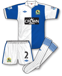
 Blackburn’s new home kit (the first to be ‘tailored by Umbro’) reverts to a more straightforward interpretation of their familiar halved shirts. Except for contrasting fabric across the top of the shoulders there’s nothing to distract from one of the most iconic strips in English football – not even red trim which can often be found lurking somewhereon a Rovers kit. The shirt is accompanied by standard Umbro shorts and an interesting sock design with a multi-hooped turnover.
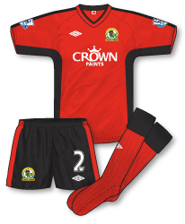
 At first inspection the away is another fairly ordinary design in that good old Blackburn change colourway of red and black but I found the more you look at it the more classy it appears. There’s a neat black trim down each sleeve (will we ever see the famous diamond trim return to Umbro kits for a last hurrah?) and curved black panels under each arm and along the side of the shirt which is formed from a similar template to that worn by the Wales national side. The shorts feature a broader side trim to marry up with the shirt panels.

Great illustrations and write-up, as usual, John.
Umbro really are doing a good job at the moment, in my opinion. This may sound odd, but they really seem to be putting a lot of thought in their designs, where as often manufacturers seem to just be churning out kits.
I have to say though, I think the Blackburn home kit always looks better with blue socks, it really helps the balance of blue and white, I think. With white shorts and white socks, there just doesn’t seem to be enough blue for a Blackburn home kit.
Other than that, which is only a small issue, more good work from Umbro.
By the way, just thought I’d mention John, it seems the away kit from last season – white with red shorts and socks – is being kept on as a third kit. I only say because I see you’ve added a similair thing on the end of the new Arsenal kits.
🙂
I think the best thing about umbro’s kits at the moment is the shorts and socks. Nothing fussy or fiddly, like the nike amd puma world cup socks for example but they just match the shirts so well.
Nice simple away kit.
I like the home shirt and shorts but think the socks are too fussy and draw attention from the rest of the kit. I agree with the above comment that Blackburn kits generally look better with all Blue socks.
I think the home shirt is great. Nice and simple, spoiled only by the black box sponsor’s logo. Why Crown cannot modify it so it blends with the shirt, I don’t know.
I’m another one voting for blue socks though. Also not keen on the away, which is a bit fussy in comparison with the home.
I love the home shirt…I can’t stand red on Blackburn kits as it just seems extraneous. I also love the socks and think it provides a nice balance, else the design could have looked too blue-top-heavy. On that note, I think all blue socks would be too much and unbalance the whole kit…the shirt should be the centre of attention (IMO) and the shorts n socks compliment that and, while fussy in their own right, I think the amount of blue on the socks is just right.
The away is a nice classy affair, albeit a touch on the dull side.
The home jersey is top class.well suited to the “tailored by range”.
Not that keen on the away strip though.a bit too bland for my liking.
Do umbro have special tracksuits coming out for the teams they make jerseys for.seen an ireland tracksuit recently with the logo and umbro written just below it.had a retro feel to it.Looked great.
On first glance the away strip looks very like a design Umbro used at start of the last decade
You’re right Denis – I’m thinking of a kit design worn by Celtic and Ireland? Is that the one you have in mind? I must admit, I really liked those kits as well but I do take your point.
Yeah John, they’re the ones I’m thinking of, the Chelsea away in 01-02 also similar
I like the home kit, but am I the only one who thinks the away kit is like something you’d have seen a team wear in like 2001/02?
Just seems a bit outdated to me.
Denis and John, I thought that about the away kit as I have that Gold Celtic Away shirt from your thinking of, I also recently noticed a lot of Irish Clubs used the same design in different colours around that time.
As you yourself eluded to John and a poster above – why has Umbro stayed with these plainer styles for so long now since really about 2000. At lot of other brands have made some good old school tributes in their strip design, yet easily one of best 90’s designer stays well away.