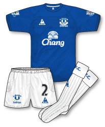
 It has to be said that under Umbro Everton’s kits were beginning to stagnate somewhat. Since Le Coq Sportif arrived back at Goodison last season they have breathed new life into the club’s kits. Last year’s early 80s ‘homage’ I felt was a little over-egged, but this year LCS have really revamped Everton’s kitbag. The new home shirt is all blue with no outward contrasting trim at all (save of course badges, logos etc). The chest features a curved panel of breathable fabric framed by reverse stitching. The shorts are plain white and the socks minimalist in design, featuring only the EFC monogram and LCS logo. Its a simple, uncluttered strip but full of class.
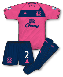
 The away (which incidentally was launched before the home) more than ruffled a few feathers on its unveiling. Yes, its pink and not the subtle salmon pink colour Everton have been associated with in the past, but bright, fluorescent PINK! The colour featured as trim on last year’s all black outfit but this time takes centre stage with a bang. The design of the kit is the same as the home, but with the chest panel now picked out in navy and with additional pink trim on the shorts (only visible on the back). Pink change shorts and socks will also be worn with the shirt this season if necessary. Its certainly a bold design with a colour that challenges what some consider to still be a homophobic element to football fans. No doubt though it will be popular with Goodison’s female clientele if the popularity and sales amongst ladies of the clubs recent two pink breast cancer charity shirts are anything to go by. I think the strip is very brave and despite my initial reservations I’m beginning to like it.
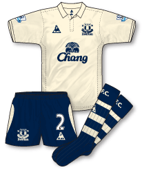
 On to the third….which has to be one of my favourite shirts of 2010-11 – notice I said shirts and not kits. More of that in a moment. The jersey, which makes more than a passing reference to the highly successful England home kit of 2009-10 (blended with the England retro commemorative rugby kit worn earlier this year) is just pure class and as Everton’s marketing claims is “rich in heritage, modern in design”. The off-white/cream/vanilla (delete as appropriate) shirt is simply stunning and is paired with navy shorts and nice retro hooped socks. Ah yes, the shorts. Maybe I’m being picky but to my mind its the shorts that let down this otherwise superb outfit. For some reason LCS have used a design with a curved contrasting panel on each side that joins up on the back rather than a simple, plain, all navy pair. Apart from the fact that this kit doesn’t seem to fit as a set of strips with the home and away, it jars with me that the fine retro shirt and socks are joined by a very contemporary and alien design of shorts that, to be honest, would look far more at home with the home or away outfits. It just seems strange and I wonder if LCS deliberately made these third shorts very different simply to distinguish them from the away kit’s navy pair? Its a shame and partly sabotages what otherwise would be, for me, a strong contender for kit of the season.

Totally agree with you on the third kit John, the shorts do let it down somewhat!
I’m sure the pink away will get a few ironic wolf whistles, but I have to ask with pink being such a rare colour in football why is there a need for a third kit?
i am a man
i manly man (football lager snooker lager darts lager and women are my hobbies)
but i always say
that a man who is comfortable with himself (especialy one who oozes machismo like myself lol im kiding of course) should never have anything to fear from pink
and i myself have a couple of pink t shirts one in baby pink and the other in laser pink and i would certainly wear this if sheff wednesday brought one out (tho i have to say i think baby pink with white trim would look better
but i do agree with alan why have a 3rd kit when the away is so unusual (crystal palace could cause problems i suppose) tho i hope its not just incase the manly (baby more like in some cases) players refuse to wear it
i personly hope it catches on hell maybe its the lastest thing like that 90s ecru phase lol
Thats the other thing I didn’t mention Alan – Everton have seldom needed a third kit in recent years but are one of a relatively few sides that have launched three new kits every year for the best part of a decade.
Normally I’m not a great fan of very plain kits…I like something contrasting, if only to stop it looking like a t-shirt. The home kit, however, is very smart indeed…and I mean the kit as a whole. That they haven’t strayed from the simple look, as they have with the 3rd, just adds to the overall classiness.
As for the away, well I love it. Away kits seem to be a testing ground for slightly eccentric designs and I see nothing wrong with that…there’s not the same commitment to club heritage etc and I think this is a great outfit. The 3rd is also very nice indeed…it’d be nice if they retained this as an away kit next season if only so it coukd see the light of day a few more times than it’s likely to. Agreed re the panel on the shorts though…just jars with the rest of the outfit.
Agree wholeheartdly, best set of kits in a long time. Away is kit of the season for me (second year running incidentaly).
As has already been said, third kit marred somewhat by out of character shorts.
I’ve already been to Goodison Park twice this season (with my Evertonian in-laws – no one mention Arteta or 93rd minute) and I must say, I have spotted that the away is being worn mainly by women and kids. Pink is still not too popular amongst male Scousers.
The home kit is alright, but the thin crew neck collar makes it look a bit cheap. The third kit will likely only be worn once as a token gesture as it is entirely superfluous and unnecessary, but it is a really nice one (overly fussy shorts excepted) and probably the best LCS effort I can recall.
As usual though, that massive Chang logo brings them all down a notch or two. The sponsor-less kids versions are far better looking.
I have never liked having “Everton” underneath our badge. I wish the club would ditch it moving forward. This season’s kits would look even classier with a normal, simple Everton crest. Having said that, the home and 3rd kits are fab!
I always been a fan of LCS kit designs as a kid in Australia – it was a very bizarre brand only seen on things like Coventry shirts in SHOOT! When I first saw the original LCS Everton shirts from back in the day I thought they were really cool and I actually quite liked the Home and Away last year.
I have to say I’m really jealous of the Everton kits this year, the third shirt is a massive keeper whilst I think the pink one will also be a great one to add to your collection. Once again LCS are as close as anyone as being right on the money when it comes to new ideas in Kit Design.
LCS made some great Coventry kits…some of my favourites, though mostly disliked by the majority of Cov fans it would seem.
Thye pinnacle of which was the Yellow and Purple striped away kit!!!
Ah yes…that thing… The purple Pony one was worse…honest 🙂
well i liked some of those especialy the home shirt that lcs did in 1999 with the white under arms it stood out well
Rich, I actually liked all three Pony kits, arguably bettered only by the Hummel home shirt.
I really didn’t like the Pony kits at all…thought the home one was a sort of bubblegum blue and the 2 away kits just didn’t do it for me…it also coincided with a truly dour time (Phil Neal in charge!) so it just reminds me of then. The LCS ones were a real breath of fresh air to me…but then as I say, I seem mostly out of step with the majority of other Cov fans.
Was at Chelsea v Everton at Stamford Bridge, expecting/hoping to see the pink kit in action…very surprised to see the cream one!