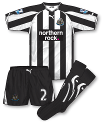
 After 15 years Newcastle United have ended their association with adidas and switched to their German rivals Puma for their new outfits. Stealing the club from under adidas’ noses must have put the pressure on Puma to deliver kits that were of the highest standard and anticipation was high to see what the club would wear. Puma’s first set of outfits, for me, do deliver. Much to the disappointment I’m sure for some of the Toon faithful they are template driven although the home does have its own identity which should please fans in the North-East. The home includes the new neck design Puma premiered in the World Cup along with black ‘shoulder pads’ that arc down each sleeve. Fortunately this is the only design element that really breaks up the famous black and white stripes – although the white flashes that run from the neck down to the armpit do continue on the sides of the shirt which seems a bit of an unnecessary distraction. Personally I’ve grown tired of seeing Newcastle’s stripes broken, disjointed and generally messed about with over the last few years. Although last year’s adidas effort was better than some I would like to see the stripes presented on the shirt unadulterated next year.
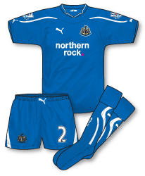
 Although they are simply template designs in my opinion the away and third are the best of the bunch here. Great to see a good old traditional Newcastle away colour introduced – blue. The design is great, the shade of blue spot on and the whole kit hangs together very well. Not 100% sure about the Puma ‘belt buckle’ effect in the shorts waistband (also present on the home kit) but to be fair at least its something different and it is rapidly growing on me. Only downside is though with many players wearing their shirts untucked (what happened to the ruling that all shirts must be tucked in – wasn’t that a yellow card offence at one time?) the branding is often lost.
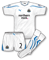
 The all-white third also looks stunning and like the rest of the Puma kits fit really well. Essentially its a straightforward reversal of the away with blue now providing the trim.
A great set of kits for Newcastle – let’s just see the black and white stripes rendered plainly next season!

I agree, John, they are fine set of kits.
It is a strange one, regarding the breaking up of Newcastle’s stripes. I’m not as against it as some people are – as I think the switch from white to black on the back of the shirts – sometimes gives the shirts a fresh look.
Anyway, I always thought they only broke up the stripes on the back of their shirts because of a ruling, to make the shirt number more visible – but what about Sunderland – they never seem to break the stripes?
Even West Brom, who have often broke the stripes in recent years, have fully striped shirts this season.
Strange…
notice how carefull puma were not to a black cat on any of the kits esp the on the home shirt ….very easy mistake to make as pumas normal 1st choice is its logo in black… which is also a nickname for sunderland if im not mistaken ??
There’s no ruling in the PL as far as I am aware but there is in Europe, even if the two stripes colours are dark and the number is clearly legible (eg Barcelona and the two Milan clubs).
And even though Newcastle have the white space on the back, Match of the Day in their team graphics have the full stripes with red numbers which cannot be made out!
Hello MisterSifter – I’ve not got too much of a problem with the backs – needs must etc. Its really any different sleeves, adornment, embellishments, shoulder panels etc that appear on the rest of the shirt that bug me. I think 2001 was the last time a relatively pure and untouched set of stripes appeared on the Newcastle shirt.
Discodave – good point!
Fairly safe set of kits with the 3rd kit pick of the bunch for me. Nothing anywhere near as controversial as last years yellow striped affair.
I really liked last years Puma template (a la Tottenham) and it would have been interesting to have seen what they’d have done with Newcastle had they been under Puma’s wing last season.
Am I the only one who thinks that the away and third would be better if black replaced blue? It would mean that all of the kits would represent Newcastle’s colours, similar to Crystal Palace’s set of kits in 1990-91
Denis, if Black replaced Blue surely you’d have three black and white kits and therefore now way of avoiding a colour clash. The Palace kits in question had to rely on a yellow 4th kit to avoid this.
I think they could have the set of kits Denis mentioned, Mark.
I wouldn’t really recommend it, and I like the kits they have gone with, but when they play a team in white (Fulham) they could wear the home kit – as you often see a team in black/red/blue etc and white stripes against a team in white. Or the black third kit, if you wanted to be on the safe side.
If they play a team in black, which isn’t likely anyway, they could wear the white away kit.
Or, am I missing something…
I think the all-black would suffice against West Brom for example, as they have white shorts and socks (and indeed a black away of their own). I don’t think Palace wore that yellow fourth kit Mark?
I also think using the white shirt against West Brom, would be fine. Although, with West Brom it really depends on what design they’ve gone for that particular season. Obviously, if they go for white backs, for example, you would be better of wearing black. And if they go for navy backs, I think the you’d be better off wearing white.
Going by their home kit this season, personally, I would go with white. Although, you could go for black, I suppose – what with them going for the unbroken navy and white stripes this season.
I just think white is clearer – in that situation.
Just dug out True Colours 1 – regarding the Palace fourth kit.
It’s described as “seldom worn” – although it doesn’t state any matches in the ‘worn in/worn by” section.
I think the fact that Palace absurdly wore the red third away to Villa would indicate it wasn’t used!
MisterSifter: What if they drew Notts County in the cup with only white and black change kits? I don’t see the point of the white third kit anyway as they should theoretically only need it if they play a team in all black or blue and black stripes – and I can’t think of anyone who wears them as home colours in England (not since Rochdale switched). More of a problem would be if/when they face a team in blue and white stripes such as Sheffield Wednesday.
I don’t mind the designs of the away and third (although all it is is the Italy shirt minus the ridiculous gladiator chest armour/muscle suit design), but I absolutely hate that collar. Puma have been churning out such awful templates lately, but it is a vast improvement on last year’s “collarbone” effort. Not sure if “effort” is actuallu a suitable word to use to describe such lazyness on the part of Puma’s design team, however.
Also, I’m not a fan of raglan sleeves on striped shirts either, so I am not to keen on that home shirt.
To be honest, If I were a Newcastle fan, I’d never change out of the 1995 adidas home shirt anyway… well, perhaps only to put on the same season’s away. They were modern kit perfection.
Tim: Newcastle would wear the white kit. It wouldn’t be a problem, it happens a lot.
It would just be like this from when Newcastle played Fulham a few seasons ago. Only with Notts County as Newcastle, and Fulham as Newcastle – if you know what I mean…
http://www.gettyimages.co.uk/detail/1697957/Getty-Images-Sport
Spurs wore their home kit at St James’ in 2000-01 as their away was navy, the previous year when the clubs had the same home kits Spurs wore their yellow away.
And somehow this was deemed not to be a clash: http://cache2.asset-cache.net/xc/1521399.jpg?v=1&c=NewsMaker&k=2&d=77BFBA49EF878921F7C3FC3F69D929FDA92D89463929CD4B788AE9CB8B58C363E5148C20D9BA5938
With owning every Newcastle home and away replica shirt since
1974 and also posessing a number of Newcastle match worn shirts I’ve seen some brilliant shirts, namely the 95/96 home classic and the bukta 76/80 home shirt and some ghastly, best example being the 97/98 away shirt. My view on the current set of puma shirts is that although they are based on the standard template that is not too bad, the quality of the shirts are very poor, the crest badges just looked embossed onto the shirts and the sponsors black patch on the home shirt looks very cheap. Having said that the away and 3rd shirts are simple in design but look very cool and effective. I’m hoping that puma make a better shirt for the next home version.
Either way we all still wear them in numbers with pride.
not a patch on there neighbours umbro kits i have to say, not keen on puma to be honest,the awful way they’ve ruined the italy kit has put me off.
Have to agree with you john b…the latest Puma kits are not great. I loved their last few Italy kits, especially the Confederations Cup one, but the WC2010 one was truly awful…and I’m still not sold on this ‘star’ neck design. Last season’s NUFC kit was far better than this year’s…and I quite liked that yellow kit after a while.
I remember that FA Cup game that Newcastle played at Tranmere, it was a terrible kit clash that the referee somehow let go and was rather confusing to watch on TV.
That was in the 99/00 season, when Newcastle had a white away kit, which only got used the once at Coventry (rather unnecessarily) but foolishly had no third kit – the previous season’s away kit (blue) was not retained when in truth it should have been.
There was an even worse case at West Brom at the end of the 02/03 season, when Newcastle wore their rather absurd silver and dark bluey-green strip for the one and only time in the league (they’d used it against Juventus in the Champions League which was a bad clash to be honest) but this was worse, because West Brom’s kit was based on their 60’s effort, and it was sunny too, making the silver look more like white…
http://cache4.asset-cache.net/xc/2004782.jpg?v=1&c=NewsMaker&k=2&d=77BFBA49EF878921F7C3FC3F69D929FDF6B66A87A1CCE66ADDDF4B514DE345E5CDDAE9CCA874BAAB
Come to think of it Newcastle had a kit clash problem in pre-season too, they wore the current third kit at Deportivo La Coruña, whose home kit is predominantly white this year with what appear to be 1″ stripes
http://cache2.asset-cache.net/xc/103224197.jpg?v=1&c=NewsMaker&k=2&d=77BFBA49EF87892102A727B1636DE2E664202787576A1A236A60786014316976C072D8447C52F475
Beggars belief Jon doesn’t it?! Why on earth adidas thought a navy and beige away would solve colour clashes for a black and white team is beyond belief! As far as I can remember, the only other time it was worn that season was against Juventus, though the shorts and socks helped to differentitate in that game http://www.gettyimages.co.uk/detail/51532481/AFP
Jon you make a good point about the 02/3 grey and blue or “opal and marine” kit. Newcastle actually printed the 01/2 blue kit with champs league printing and patches in case uefa didn’t allow the 02/3 kit. They also had a problem for the West Brom match that year as the blue kit had become “unavailable!!??” and had the referee not been happy with the colours, Newcastle would have been wearing the Baggies’ yellow and green!
Denis, you also spotted the clash against Tranmere which you have linked from the 99/00 season. To see the clash in action, http://www.youtube.com/watch?v=dMVpuC8V9Pc follow the link or type Tranmere Newcastle into youtube.
That game rivals Tottenham-Blackburn from 2005-06 as the worst I’ve ever seen!
I noticed that picture of Newcastle and Juventus was at St. James’ Park – yet Newcastle are wearing their away kit – and Juventus are wearing their home kit.
I see in the return fixture in Italy – Juventus are wearing their away kit – and Newcastle are wearing their home kit.
http://www.gettyimages.co.uk/detail/1440542/Getty-Images-Sport
What’s that all about!?
In the first year of the Champions League (1991-92), one of the rules was that the home side changed in the event of a clash, Arsenal wore the bruised banana at home to Austria Vienna and Benfica
http://www.youtube.com/watch?v=cpvAihTS3qo#t=3m20s
http://www.youtube.com/watch?v=NVNehd_EG2M.
The following season that seemed to have been shelved as Leeds wore their change kits in away games, but in the years that followed it was a thing that seemed to crop up on an ad hoc basis, for example Man U wore white at home to Barcelona in 1998 (but also at the Nou Camp). That season Arsenal and Lens changed at home to each other too, and again when they met in the following season’s UEFA Cup.
The season that Newcastle and Juventus changed at home, Man U wore all-blue at home to Olympiakos.
Thanks for answering that question, Denis.
On the subject of strange kit choices – Arsenal wore their red change socks at Birmingham tonight – for no apparent reason.
For some reason they’ve started doing that MisterSifter – wearing the red socks away from home when wearing the home kit, they also did it at Newcastle in the Carling Cup.
What I found most confusing was that Arsenal wore their away kit against Everton and Wigan, but the home tonight, it doesn’t follow any kind of logic
Yeah, Arsenal are a bit strange when it comes to their choice of kit. As you say, it doesn’t seem to follow any kind of logic.
It’s not just the outfield kit, they seem to make some strange choices when it comes it goalkeeper kits. For instance, wearing a goalkeeper kit that is a very similair colour to the outfield colour – when they have other goalkeeper kits that would be more suitable.
I’m beginning to think that they have a very moody kit man!
The kitman is Vic Akers, who was manager of the Arsenal ladies’ team for years, which may explain the moodiness!!! (I hope no ladies are reading this!)
I’ve noticed some teams don’t change shorts in the event of shorts colour clashes in Premier League games, but have done so in the FA Cup.
For instance, Wolves wore old gold shorts for their third round tie at Doncaster, and last night Stoke wore red shorts at Cardiff, which made them look a bit like Liverpool from behind (with their much-maligned plain backed shirts they got this season).
You’re right Jon – its all to do with Premier League rules and Football League/FA rules I believe. One treats shorts clashes seriously the other doesn’t. Don’t you just hate single colour backs on striped shirts?
On the subject of shorts changes, Jon and John, it seems that Birmingham can’t make up their mind.
This season they wore change shorts against Arsenal and Manchester United, but didn’t bother against Stoke and Blackpool.
Odd.