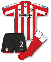
 Not much to complain about kit-wise at The Stadium of Light this season as Umbro have turned out a solid pair of strips for The Black Cats. The home design is clearly based on Umbro’s classic late 70s/early 80s Sunderland outfit with its tidy collar and sober stripes. On closer inspection though the stripes actually feature a very subtle zig zag weave which is comprised of tiny Umbro diamonds. A nice touch and again reminiscent of late 70s striped kits which were often seen to have a similar effect due to the style of the fabric. The socks are also based on the late 70s pairs and feature simple white turnovers. Online bingo company Tombola become the club’s new sponsor although the logo doesn’t feature on children’s replicas due to recent gambling legislation. The whole design of the kit is simple but very effective – plus its refreshing to see a jersey that doesn’t mess around with the presentation of the stripes – adidas take note!
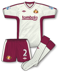
 The club’s new away is another superb Umbro strip. I have to admit I really like the subtle muted off-white colours that are appearing this season (see also Everton’s third kit) and this shirt is comprised of a colour rather grandly named as silver birch and trimmed with zinfandel (that’s claret to you and me). OK, naming issues aside, the colours form such an interesting combination on the strip (which is almost identical in design to Blackburn’s away kit) and create a really individual and classy looking outfit. One of my favourite’s of the season.

best home kit in the premier league this season by far,classy and simple.
Really like the home kit. Totally agree that Umbro have got it spot-on with the stripes. No fussy trim cutting into them, nice and simple. I think it would have looke much nicer with regular sleeves instead of raglan ones though.
I like the colours of the away, but it’s a bit too fussy. Get rid of the stripes down the shoulders and under the arms and it’d look a lot better. As it is it’s not different enough from the home shirt for me. I like change kits for teams in stripes to be very plain.
Fantastic kits. The home is wonderful in its simplicity, and while the away does follow a template, the colour combination is sufficiently unique as to make the kit interesting.
Just wondering if it would trouble the Sunderland players unduly not to wear those stupid compression shirts underneath? Especially when they wear unmatching white ones with the away. I’m looking at you, Bolo Zenden!
Personally I think that compression undergarments, worn in combination with short-sleeved shirts, compromise the visual integrity of kits. Or is that too lofty?!
I agree fully Nick, they look terrible with striped shirts
It was weird seeing Manchester United wearing their white away kit against Wolves yesterday.
You know, I think it was the first time I have seen Manchester United wear an away/third kit when they didn’t have to.
I always thought they were “committed” – if that’s the correct word to use – to wearing their home kit on their travels, unless – obviously – there is a clash.
To be honest Kaz there have been occasions where teams have worn red against Wolves, where I’ve felt they should change. For instance Liverpool the other week wore all-red, where I felt that their white away strip would’ve made a much clearer distinction.
I thought the same when I watched MOTD this morning Kaz but Nick you make a very good point.
OK, technically red and gold shouldn’t clash but I remember thinking last time the two clubs played each other in their home kits that greater distinction could have been made. And thats the point – the aim of a kit is to make sure a) your team mates can see you clearly and b) that you can differentiate between the opposition. Fergie pays great attention to the club’s choice of kit and no doubt he felt that white would be a better option and I think he got it spot on. Didn’t help them much though! Great win for Wolves.
I wonder if it’s a case of teams changing when the game is under floodlights?
I originally had my doubts over Sunderland’s away kit at Stoke and whether it was distinguishable or not but after watching the game yesterday (a thrilling match at that!) the two teams were easily distinguishable, especially as Stoke’s shirts have the much-maligned plain red back.
Sunderland also wore zinf…….. err claret socks as well.
P.S. I was surprised that Man U wore white at Wolves, when other teams have turned up at Molineux in red.
I take your point, Nick and John, but I don’t really see the problem with Wolves’ old gold and red, to be honest.
Andrew makes an interesting point, regarding the game being under floodlights. As we know, Ferguson often has United changing to white socks when the game is played under the floodlights – so this could be a factor with United wearing all-white yesterday.
This has got me thinking though, regarding Manchester United. Can anybody think of a game when they wore a change kit when they didn’t have to?
I’ve been racking my brains and haven’t really come up with anything, and you guys seem to have been watching football longer than me! 😛
i can remember United wearing red against west ham in an evening game at upton park,i hate United wearing white socks,looks awful,didnt see any reason for wearing all-white yesterday? didnt exactly help them did it? 🙁
Was that around the mid-90s John? For some reason Arsenal wore their home kit at Villa Park and Upton Park in the league during 95-96 and 96-97 – though in the 95-96 Coca-Cola Cup semi-final against Villa they wore their yellow third.
yes denis, a monday night game in 96,cantona got the winner, strange they wore red and its the only occasion it happened i think.
@ Kaz: There was the time they played Southampton in ’96 and made a completely unnecessary change at half-time. They were 3-0 down at half time and Ferguson blamed the kit, saying his players couldn’t see each other. How fortunate that they happened to have their third kit with them….ahem.
While on the subject of unnecessary kit changes I think Blackpool wore their away kit without good reason against Everton on Saturday, unless they didn’t want to clash with Louis Saha’s hair!
Denis and John – I clearly remember United wearing their home strip with black shorts in that game, it was 95-96 wasn’t it? As the years went by I remember thinking how odd that was.
Kaz – Not a complete kit change, but United have worn white socks at home on a few occasions over the years. I think they might’ve done it a bit around 03-04? I wasn’t a fan, though – surely a home team shouldn’t be allowed to change? It should only be the away team that makes any change, in my view.
Regarding teams wearing red at Villa Park – in 89-90 Chelsea changed from their home to a red away, while the following season Palace wore their all-red third there.
Wasn’t there a lot of “issues” with Villa’s home kit in 89-90, Denis. Which resulted in lots of teams sort of not really knowing what kit to wear, or introducing emergency third kits for the trip to Villa Park? Or, am I thinking of a different season. I’m sure it was in the late-80’s.
I don’t know why Arsenal wore their home kit at Villa Park in 95-96 and 96-97 though. I mean, Villa’s home kit was a fairly standard Villa home kit, and Arsenal have always wore a change kit at Villa Park, before and after those matches. Weird.
By the way, here’s a picture of Manchester United wearing red at Upton Park in 95-96.
http://www.gettyimages.co.uk/detail/1231133/Getty-Images-Sport
Why they didn’t wear the grey away kit, or the blue and white third kit, I don’t know. I mean, they’ve wore a change kit every other season at Upton Park.
Fine set of kits but not really convinced about the sponsor.would have been great if boylesports had stayed around for one more season.
the stripes works well on the athletico bilbao kit aswell.
personally I wouldnt be a fan of internet sites being sponsors but thats the world we live in.
I’m not a fan of internet gambling sites either, I don’t think they should be allowed to sponsor football teams. However, Tombola’s logo is a lot less of an eyesore than Boyle Sports – that blue blob is very ugly.
An example of Man Utd wearing a change kit when they didn’t need to http://www.gettyimages.co.uk/detail/52874130/Bongarts
The red stripe is hardly a clash when you consider the West Ham Man Utd match in 96 or this
http://www.gettyimages.co.uk/detail/1521359/Getty-Images-Sport
That Tranmere-Newcastle game was a terrible clash!
Another recent example of United changing without fully needing to was against Southampton in the FA Cup
QPR seem to be having a habit of causing bad kit clashes lately. Anyone seen their game at Preston? They wore the home shirts, which was a bad decision considering they got a perfectly suitable red and black away kit available, but they also changed shorts and socks for blue pairs.
How the ref let that go by I don’t know.
Just as bad was Swansea v Doncaster, with the latter wearing Nike Teamwear shirts in red and white hoops, with a predominantly white back. Surely they’d have turned up in their sky blue change kit?
Utter madness.
Can’t believe I forgot but Man Utd wore White against Chelsea in the 1997 charity shield.
It’s interesting what you said about apt John. Maybe the kits look fine close up as the ref sees them but on tv from a distance it’s just a splash of blue and White?
I remember that ’97 Charity Shield match and was wondering the same thing myself about Man U’s choice of kit.
A strange one, though I’m sure many people will remember that game for Beckham’s shirt having a spelling error on it!
United wearing their away in the 97 Charity Shield was simply down to marketing the new strip rather than anything else, I’d say