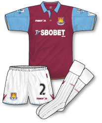
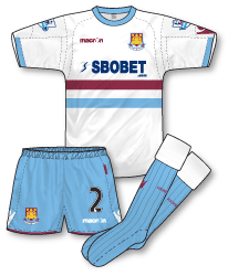
 Up until this season I haven’t been the biggest fan of Macron kits. Having seen them close up during a Southend v Leeds game last year I was amazed at just how big and baggy the Leeds kit seemed and how this style made the outfit look very dated. However I worked on some Italian team Macron kit illustrations last year and was amazed at how much better their designs for continental sides seemed.
So I was delighted to see that for 2010-11 Macron are making kits for several English teams and all of them are a vast improvement on some of their previous strips. The ones provided for West Ham are, in my view, superb and manage to bring the heritage and history of the club together with some really nice, but not over-fussy detailing, and a very contemporary look and fit. The home shirt reminds me a bit of the Pony home kit from 1995 with its formal collar and simple pale blue sleeves (constructed with interesting panelling). The neck of the collar is adorned with two gold stitches arranged in to a cross (symbolising the club’s hammer motif) and the gold is continued on the cuffs as well. I don’t even mind the large Macron logos on the shirt and shorts! Its a classic design that works just as well with the away kit’s pale blue shorts and socks that have been designed to mix and match perfectly.
 On to the away kit….another great design that resurrects the club’s late 50s/ 60s away kit of white shirt with a single claret and single blue horizontal band. Its an iconic design and its surprising that a revamped version hasn’t made a reappearance in the Hammers’ kitbag since its original incarnation. The shirt features identical stitching and panelling to the home kit – the only main difference in terms of construction is the inclusion of a pale blue crew neck and cuffs.
Two great kits from Macron, both with a superb fit – I wonder if we’ll see the famous pale blue with two claret hoops strip next year, or are West Ham due a navy away kit?

The finest home and away kits if the season as far as I’m concerned.
The pre-tailored by umbro range WHU used to wear wasn’t great and as you say John macron wouldn’t have been a favourite of mine but these are top class.great retro look.
Definitely the surprise package of the kit world this season.
Another reasonable home and away kit ruined by a poor, some might say ugly sponsors logo. It is the one crucial design element that is out of control of any shirt designer. All you can do is hope that the sponsor’s logo looks the part, on this occasion the ‘gamble’ hasn’t paid dividends.
I admit to being a fan of proper collars on tops and the home doesn’t disappoint on that front. (Puma take note!} The overall traditional look to the kit is very pleasing on the eye.
The position of the claret an blue horizontal band on the away kit is too low for my liking. If pushed I would prefer if the bands and the sponsor’s logo switched places. These bands always look better when positioned on the chest rather than near the stomach.
Cheers,
Willie
both spot on kits,the right colours and good traditional designs.
The Macron kits are light years ahead in tradition and authenticity to WHU’s history than Umbro’s third-rate home and away efforts last season.
However, I wholly agree with Willies’ sentiments about the positioning of the hoops on the away shirt. The hoops unfortunately don’t work for me in this context. Designs are made to conform to the demands of the sponsor and its logo prominence, when in an ideal world the opposite would apply. Of course Man. City’s third shirt shows how it could (should!) be handled.
The home kit works well, as it should. I think it a pity that white makes an appearance on the shirt, even in the form of the oversize Macron logos. West Ham shirts should only contain claret and blue:)
Now that West Ham are Macron’s flagship club in the UK, they have been treated with the sort of attention to detail that manufacturers lavish on their marque clients.
Would it be better if the sponsor was between the bands? While I like the shirt, I find that blue shorts and socks leave the kit as a whole looking rather weak, it looked better at Anfield when the home shorts and socks were worn.
Denis, my team Motherwell had a perfectly nice top ruined by a sponsors logo positioned between two bands. The fact it was a bright blue, didn’t help much! (see link)
http://www.classicfootballshirts.co.uk/other-uk-clubs/scottish-clubs/motherwell/2004-05-motherwell-l-s-away-shirt-l.html
You are right about the sizing of the Macron kits – I wear a large size England shirt but have to go down to small to get the same fit for my Leeds shirt.
Willie, I suspect Denis meant having one band above the sponsor and one below rather than the way Motherwell went.
Is there anyway of copying Inter or Man City who reduced the size of the sponsors logo, which in a way made it stand out.
Re the West Ham kits, I think they look cheap and nasty and are ideally suited to the club in question!
Thanks Andrew, that’s exactly what I meant, kind of like on Inter’s away kit of 98-99 http://www.classicfootballshirts.co.uk/players/roberto-baggio/1998-99-inter-milan-away-shirt-l-29966.html
One thing I have noticed about the West Ham home shirt is that players seems to suffer from quite large wet patches under the arms when wearing it, more than other teams’ players do anyway.
Other than the sponsors logos and the Macron logos on the sleeves, which spoil the classic look a little bit, I think these kits are some of the best in the league this season. Love the collars on the home shirts.
In an ideal world a reduced sponsor’s logo is the way to go. Putting the logo directly between the two bands still detracts from the purity of the design. Although it’s worth noting that the Pirelli logo on Inter’s top is also far nicer than the SBOBET logo. The problem is, most sponsor’s don’t care about the aesthetics of a shirt design, they just want maximum coverage for their sponsorship money.
Cheers,
Willie
Excellent comments everyone – Willie your first comment was almost the basis for my work on football kits as part of my graphic design degree. The clash of “identities” and how a designer copes with having to accommodate at least two branding elements and yet still retain the club’s identity. Maybe a change to the way sponsorship is included on shirts will come? The Inter kit you mentioned (and also Man City 3rd) are good examples. As things stand now though I think Macron have got the sponsorship placement correct – I wouldn’t have liked to have seen it placed over (like the Motherwell example Willie highlighted) or inbetween the hoops. Glad to hear so many of you share my views on the kits, Denis you have a valid point about the weakness of the blue on the away kitthough, I’d forgotten that was something we had commented on before. Maybe claret shorts might have been better? (if they weren’t trying to reproduce the club’s 50s/60s strip.
Andrew, the sweat situation you mentioned is interesting especially when you consider the hi-tech fabrics used today. Reminds me of the Puma kits from a few years ago that always seemed to make players sweat more.
I agree the sponsors logo and stripes look odd, but I think Spartak Moscow is possibly the worst I’ve seen this season with its broad white panel and the Lukoil sponsor low down when it would clearly look better higher up.
Spartak normally have the badge within the chest band, as they do for Russian league games, with the Lukoil logo underneath rendered as “Лукойл”, which you can see here on the new away kit : _
http://www.footballshirtculture.com/images/spartak-moscow-11-12-nike-away-football-shirt-j.jpg
However in Europe, the Spartak badge is moved from the chest band to the top right for some unknown reason, which makes the shirt look odd as you say. I’m not sure why they have done this for European games, as I don’t think there’s any UEFA regulations regarding placement of the badge.