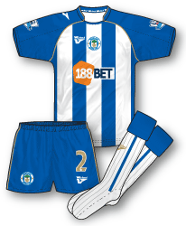
 Wigan Athletic Home Kit 09-10
After just one year with Champion Wigan have switched to lower league kit specialists Vandanel – giving the company their first ever English top flight kit. Its a straightforward design, nice and tidy, nothing too flash and certainly fair more sedate than the angular excess of the Champion kit. Gold trim tops of the outfit with the club badge placed centrally. As with many kits at the moment Vandanel sneak an extra logo on to the shoulder. The shirt also features the logo of new sponsors 188 Bet who also sponsor Bolton – the first time (I believe!) the Premier League has featured the same sponsor on two different teams since the NTL days of Aston Villa and Newcastle.
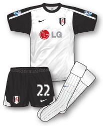
Fulham Home Kit 09-10
Nike’s third kit for Fulham sees them introduce a vastly different design to the previous two strips for the West London club. Template critics will no doubt pick up on the same design used by Arsenal and Southend Utd amongst others, but it does suit the simple black and white of Fulham. For me personally, Fulham’s Puma kits were the highpoint in recent years of the club’s kits but this shirt with the introduction of black sleeves is a breath of fresh air.
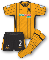
 Hull City Home Kit 09-10
Hull hung on to their Premier League status by the skin of their teeth last season and 09-10 sees them in a new design from the rich canon of kits that Umbro are launching for the forthcoming season. The club seems to be alternating between amber shirts and black and amber striped shirts although this jersey does feature the most 80s of all football kit fashion; pinstripes. The shorts are standard Umbro issue and the socks feature a nice pinstripe hoop design. New sponsors totesport.com are also included on the shirt for the first time. Its an elegant looking design but reminds me too much of Umbro’s Wolverhampton Wanderers early 80s kit.
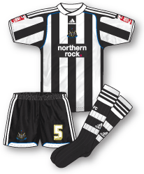
 Newcastle United Home Kit 09-10
In all the fuss about Newcastle’s ‘challenging’ away kit everyone seems to have forgotten that the club also have a rather superb new home kit for the new season – although supporters will still find the red sleeve badges of the Coca-Cola Championship hard to take. The template is essentially the same as the away but works so well in black and white. Its also good to see some more traditional looking stripes on the Toon jersey – the first time this has occured since 2001. Despite their financial issues Northern Rock remain as sponsors. Another plus point is that once again, Newcastle will retain this kit for two seasons.


Shame for Toon that their new home shirt is totally spoilt by the plain white back, save for a few stripes at the bottom. I don’t know what’s wrong with proper stripes and if the number has to be visible enough, a patch behind it, like in the old days.
Wigan’s kit ain’t bad, Hull’s is quite decent though to me it straight away smack of Wolves’ kit from the early 80’s (the one sponsored by Tatung), though I much prefer Fulham’s home shirt from last season.
Talking of Fulham they’ve brought out a new away kit in red with black side panels using a Nike Teamwear kit, but weird thing is that once again they’ve picked a template that is over 2 seasons old!
Hull City’s kit is a throwback of sorts to our 1984-86 kit which featured pinstripes, although on those Admiral shirts the pinstripes were red, which was added to our colour palette by then chairman Don Robinson. Red was thankfully cleansed from our kits in 1990, since then we’ve only used white as an accent colour with amber and black.
I prefer City in stripes (we’ve alternated between striped and plain shirts since 1947, so it’s not a new thing, Wolves-like or not, not to mention that Wolves have worn striped shirts before) but I do like this shirt a lot, especially when seen without the sponsors wordmark as it appeared in the two Asia Trophy matches in Beijing this week, it has a great retro feel. The shorts don’t quite work with it though, the shirts look retro but the shorts look contemporary. I like the pinhooped socks however.
This is Hull City’s debut on True Colours isn’t it? Excellent.
I love the total 80s look of the hull kit, especially the traditional, unfussy V neck with stripe down the middle…something I’ve longed to see make a return to footy kits for a while.
One thing I am enjoying with the new kits is the gradual disappearance of the increasingly convoluted neck designs – I like to see collars and V-necks too!
Hello Les – why did they wear unsponsored shirts pre-season? Yes, it is Hull’s True Colours debut…more to come though!
All of the English teams in the Asia Trophy had blank shirts as they’re all sponsored by betting companies, Chinese law evidently doesn’t allow for betting to be so advertised.
West Ham chose to cover their sponsors wordmark with a Bobby Moore Cancer charity patch, but it was shoddily done, West Ham seem to have a thing about unsightly patches hiding sponsors.
i like the hull strip,very 80’s.The newcastle aint bad either,much better than there away efforts!!
The new Fulham shirt, Im not a fan of, it seems wrong that a team in the prem that has qualified for europe gets a cheap looking template straight out the teamwear catalog. The away looks horrible, with huge baggy sleeves and is three seasons old. Fulham deserve better in my book.
The new home for the toon army is great, the stripes are very similar to the design of the 1995-97 home, but the white basck lets the side down. The 2003-05 kit also had similar stripes as well.
Newcastle have released another change kit in the meantime, black and blue stripes. In my opinion its pointless (might as well have kept the grey from last season) but at least it wont make people sick.
Saw it as well Matt. I was surprised to see the new Newcastle kit when I opened the Times today, especially as it looks like the home kit dyed with a lightish greeny blue with the same blue for the shorts. Definitely brought out in a hurry.